Friday, March 31, 2006

Q1 2006 Review

OK, bulls, you win. This quarter goes to you. Cheers.

The approximate gains in the major U.S. averages for Q1 2006 were:

S&P 500 +3.75%
Dow 30 Industrials +3.65%
Russell 2000 (the huge winner) +13.6%
Nasdaq 100 +3.55%
Nasdaq Composite +6%

I looked at the past quarter of my blog (my God, I spit out a lot of charts!) and thought I'd share an equal number of bad and good suggestions. I'll get the nasty ones out of the way first.....click on the links to see either the chart or the posting:

The Flops


The Winners
As for me and my fellow bears - we'll get cha in Q2! :-)

Thursday, March 30, 2006

Topping Out Continues

I was delighted, of course, that my prediction the fall would resume today materialized. That validates that the prices were simply retracing to resistance. I'm anticipating further descent tomorrow.

Here's a few favorite shorts, including stop prices. Maybe I've mentioned a couple of these before. The stop price is, by the way, the price above which the position should be closed. As always, click on the image to see a much bigger chart.

ACI (stop: 78.60)


ESRX (stop: 91.64)


FLR (stop: 88.50)


HP (stop: 72.74)

MCK (stop: 53.11)


UBB (stop: 86.64)


UTH (stop: 112.88)

Wednesday, March 29, 2006

Retracing Back to Resistance

Today's action seems to have elicited a lot of "Take THAT, bears!" from both the media and the readers of this blog.

Simply stated, I think today's retracement is to be taken in stride. Look at the graph below, which is a minute-by-minute graph of the $INDU for all of 2006. The upper trendline, briefly conquered, now represents resistance. Today was a retracement back up to that line, and I suspect tomorrow we'll start to see prices sinking again. Click on the graph for a much bigger view.

Fibber Island

Just a single quick suggestion (the meaty stuff is in last night's post - see below). GOOG is approaching Fib resistance once more. Puts on this look good with a contingent stop order at anything above $397.54

Tuesday, March 28, 2006

Fifteen Steps and a Stumble

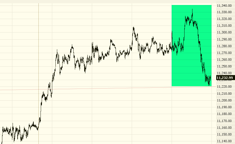
The Fed announced their fifteenth consecutive rate hike today (I'm really glad I have a fixed rate on my house.....) and stocks - finally! - did the right thing and tanked. It's about time.

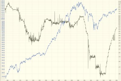
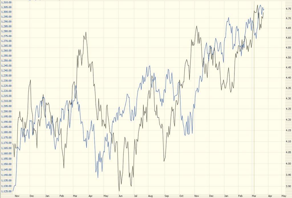
One blog reader wrote to ask me about the Fed Funds rate. You can get this from Prophet with symbol FF9413 (use a line graph, since it's one data point per day). Just for fun, I charted all our history on this versus the S&P. The correlation is bizarre. For a while they were inversely correlated. Then they seemed to be random. And recently it seems positively correlated! (Today notwithstanding). Anyway, draw your own conclusions (blue is S&P 500; black is the interest rate):


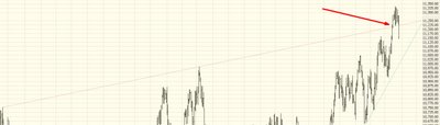
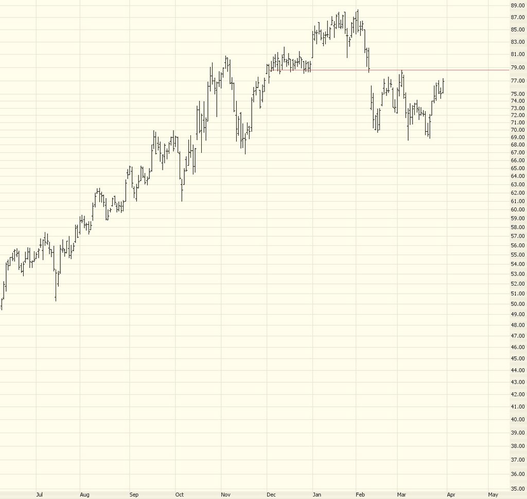
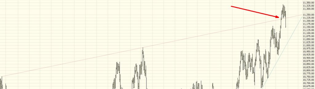
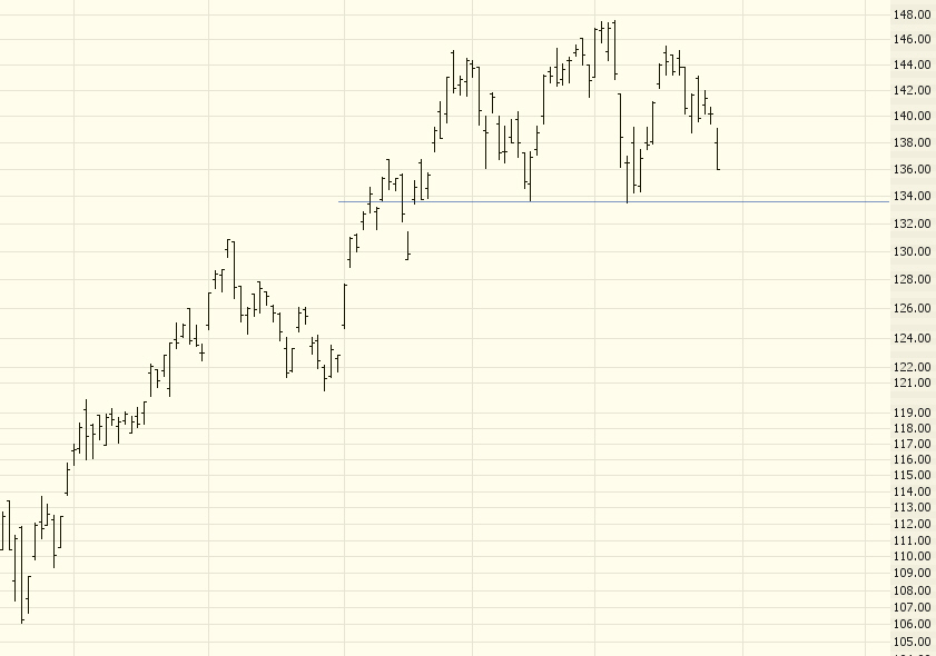
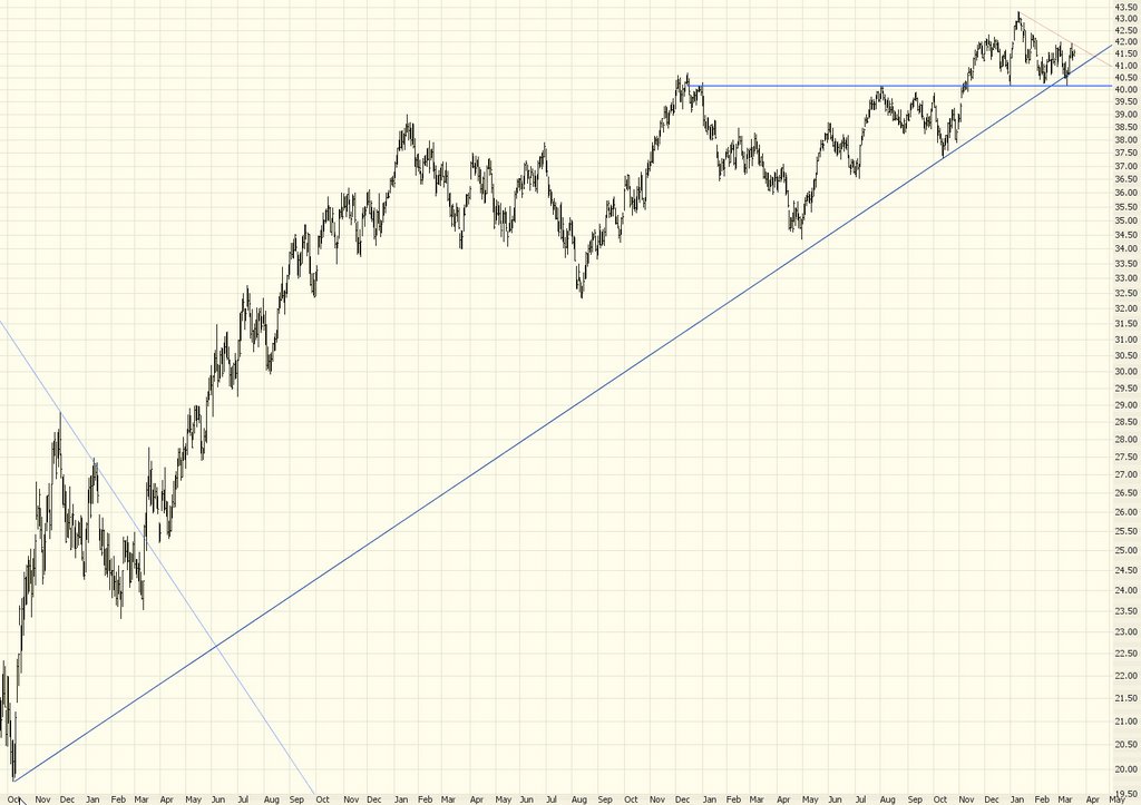
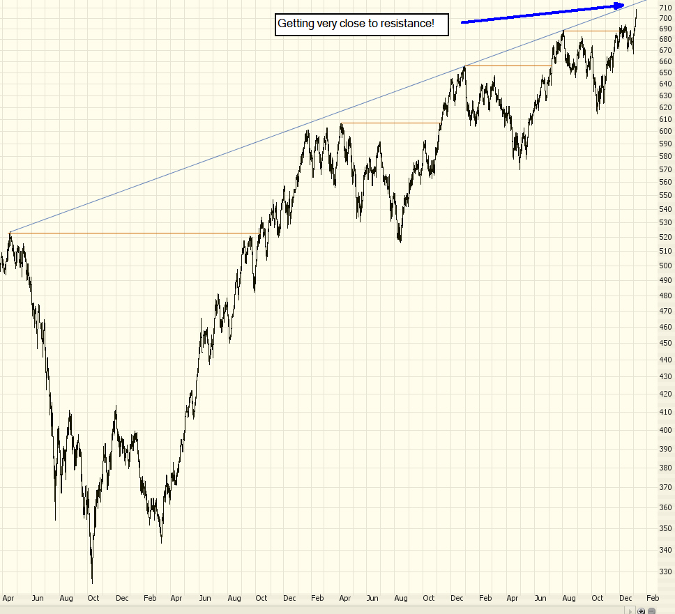
The breakout of the Dow I mentioned recently is now moot. Prices have fallen below the resistance line, so there is no breakout. In fact, this line is getting to be just noise at this point, so I'll probably chuck it soon.


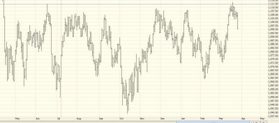
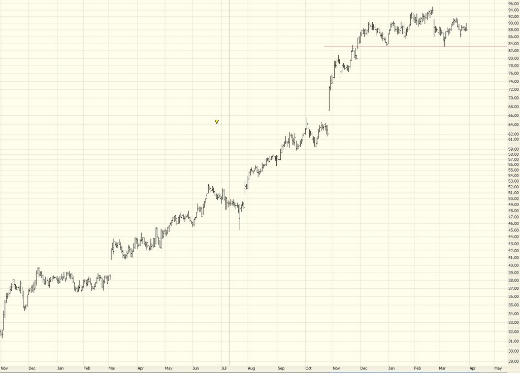
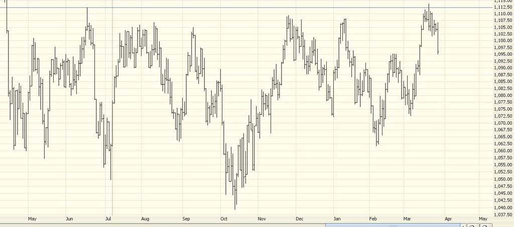
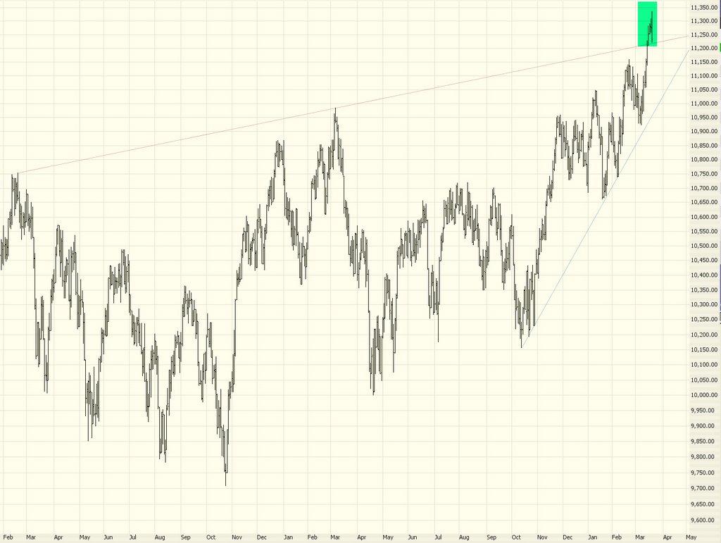
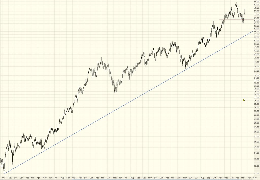
Likewise the potential breakout on the Major Market Index ($XMI) I mentioned last Saturday didn't materialize (thank God) so, again, this is a bullish move that simply isn't going to happen.


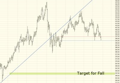
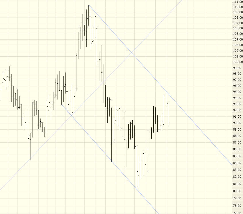
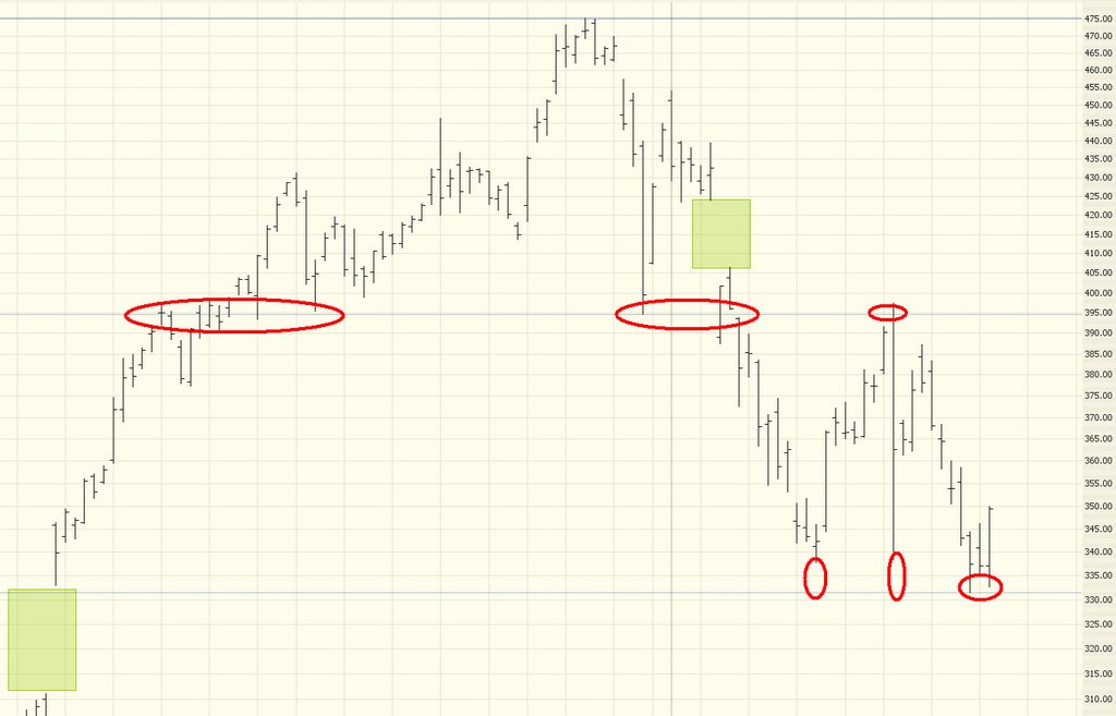
What is happening, and what I did predict quite some time ago, is the Utilities are starting to fall to pieces. The best options I've found on these is on the UTH, but the bid/ask is big enough to drive a truck through. I've drawn two necklines for this head and shoulders pattern. It hasn't quite broken through the lower neckline yet, but if it does, you can see the target I've drawn here is a nice fat distance away.


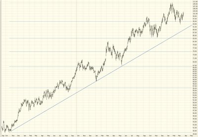
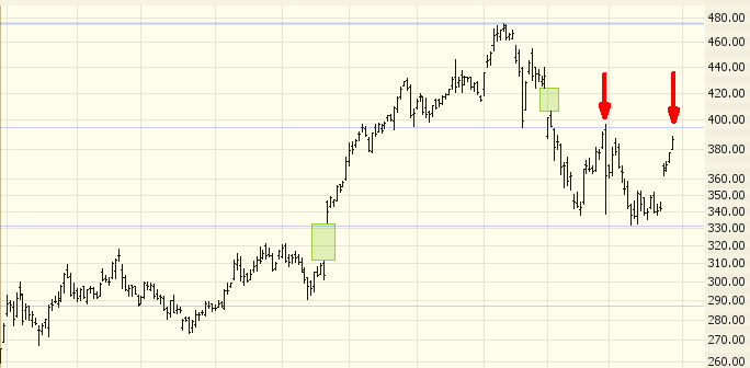
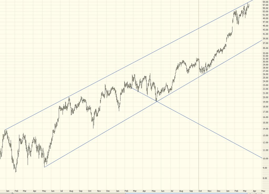
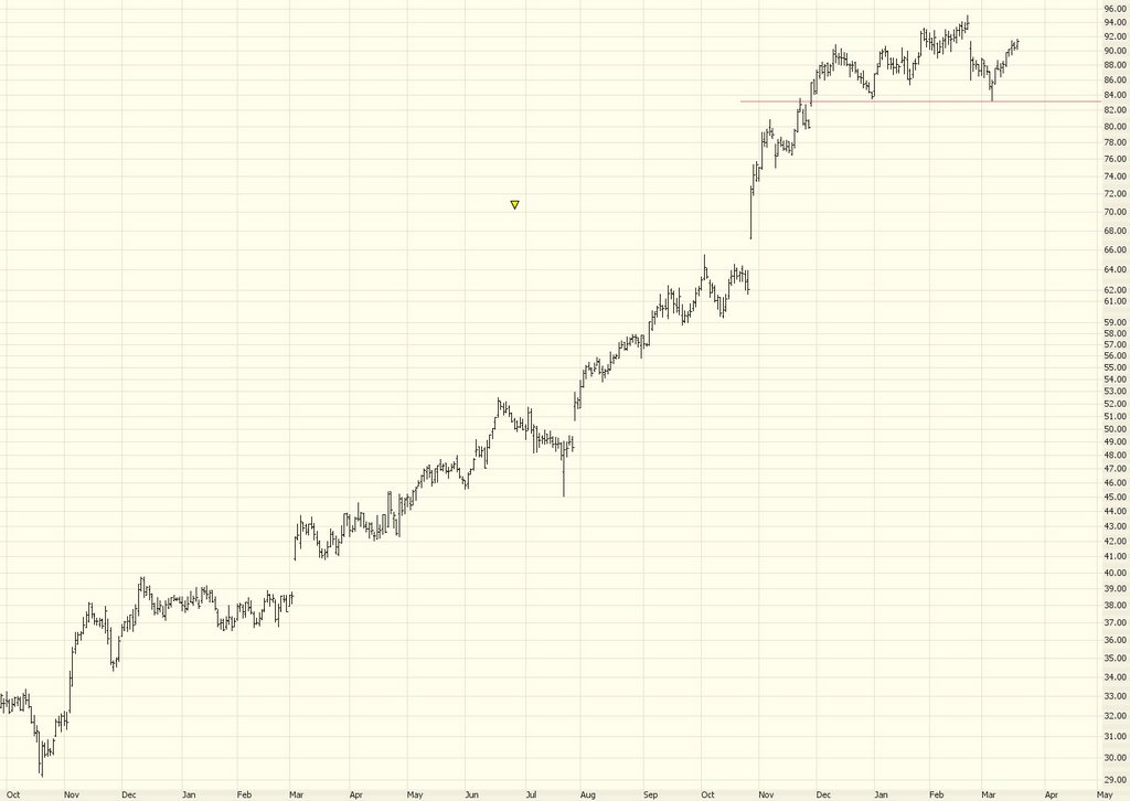
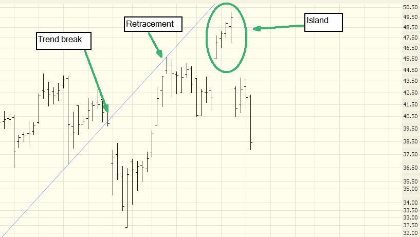
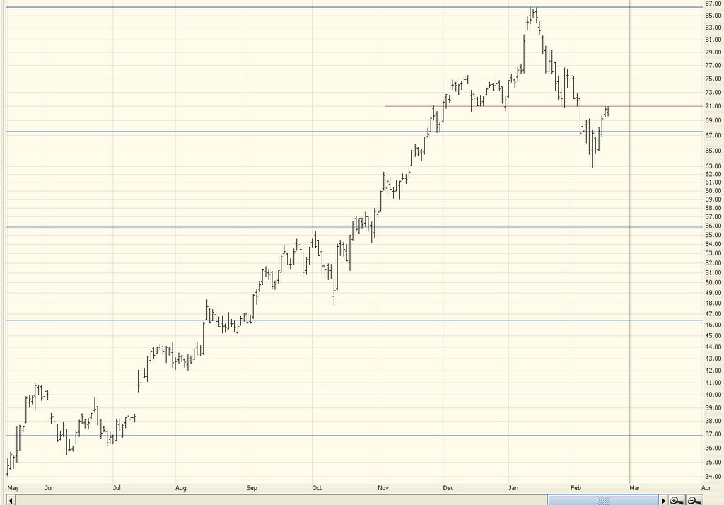
What we're looking for, people, is directional change. Nothing beats a stock that has been going up for years (and has the corresponding high price) which fundamentally changes direction. Below is CLF. You can see where it broke its upward trendline. And I've drawn a downward-sloping channel. There are not that many price points to support this channel yet, but it's not bad, and it illustrates the ship changing course from up to down. That's the kind of issue in which we want to buy puts.


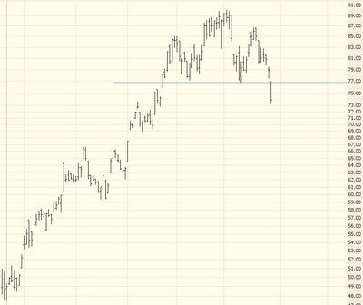
One developing H&S I've had my eye on is iShares Latin America (ILF), but it's relatively thinly traded, and the options on it are terrible (super thinly traded, huge bid/ask spread). Plus the pattern isn't complete.


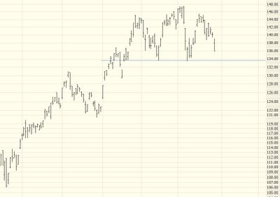
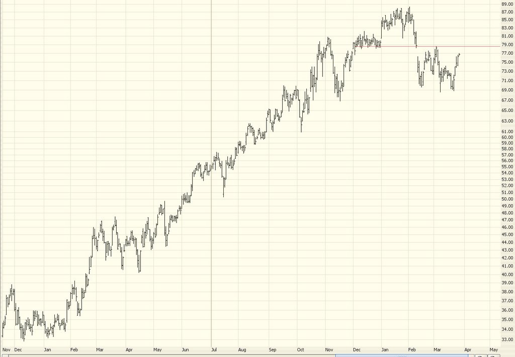
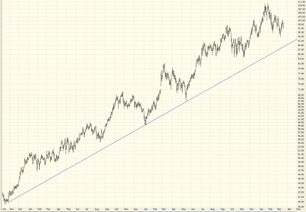
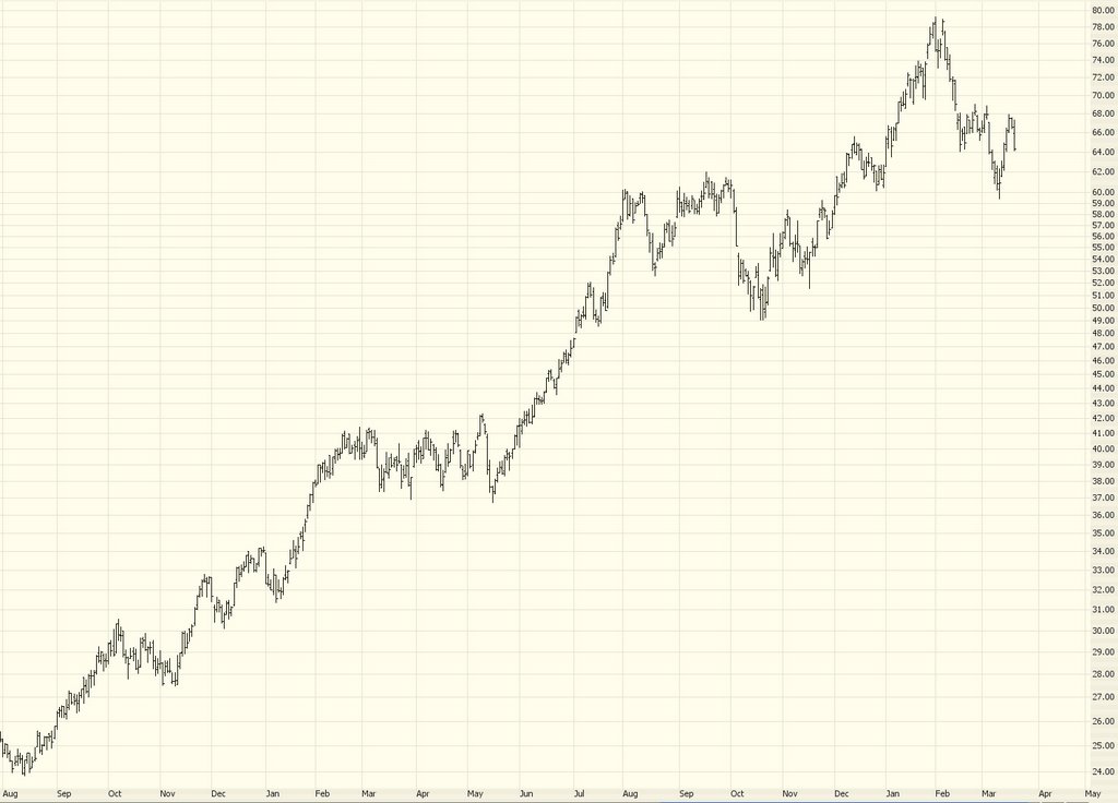
However, a major component of this security is symbol UBB, which has completed breaking an H&S pattern (strictly speaking, the right shoulder is higher than the left, which isn't textbook perfect - - but I'll take it). I'd look to buy puts on this on any pullback to the neckline. It's a lovely chart.


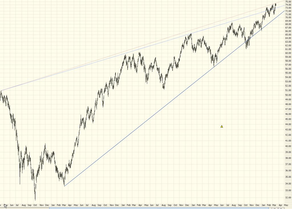
I'll close with APC - - the OIH has been pushing higher lately, but I think it's going to soften very soon, and APC behaves very well. What I mean is that when OIH is weak, APC is especially weak, and when OIH is strong, APC isn't quite as strong. I like the puts on this, which are fairly heavily traded.


Continued good luck, everyone.....nice to see some sense returning to the markets.

Thanks, Ben!

Lovely! The market got whacked by about 100 points thanks to the grim prospects of unendingly-rising interest rates. Utilities got hammered, which is as I predicted. Good.

I'll be putting up a post tonight with some updated charts and answers to your many recent questions. See ya soon......

Arch Coal Short

For your consideration, as we all await the Fed announcement (and the predictable crazy up-and-down hysterics for 30 minute afterwards). Arch Coal. Looks like a nice clean short. Stop price is anything above 78.60. It had a terrific run-up and seems to have tipped its hand clearly......the symbol on this one is ACI, and yes, there are options.

Monday, March 27, 2006

NZD/USD (One more time!)

The market is boring me to tears, and until we get the silly Fed business out of the way, I just don't want to talk about it. So how about a blast from the past?

Many months ago (like nine....) I suggested a FOREX short on the New Zealand dollar (NZD/USD). You can see the post here. .

This is the only FOREX trade I've ever recommended, but it's done fantastically well. I haven't looked, but I wouldn't be surprised if this was the best FOREX trade over that entire period:


What I want to point out to all the nay-sayers that visit this blog is the following: I was early on this recommendation. If you had checked the recommendation at various points after it was made, you could have said I was dead wrong. And the trade was a loser.

But the broad trend was there. And in the end, the broad trend crushed the little ups and downs, and my analysis was right on the money. It was a little early, yes. But it was ungodly profitable.

Something to keep in mind on those days when the Dow squeaks out a gain and people have Dow 19,000 on the brain.

Saturday, March 25, 2006

Masquerade Bull

You won't recognize me today because I've stuck these bull horns on top of my furry head. I want to make an earnest attempt to make a bullish argument for the market, since I think taking an opposing view is probably healthy. I'm still a bear at heart (albeit less passionately so, given the market's frustrating behavior), but let's take a look at some charts which point up instead of down.

First, there's the Major Market Index ($XMI) from the Amex. This index is pretty unusual in that instead of ascending, pushing up against a resisting trendline, it's formed a nice inverted head & shoulders formation. It just barely sneaked above the neckline recently, but should it clearly break above this neckline, it could mean a clean run up to about 1,180 (its all-time high) based on traditional measurement methods.


Argument number two is the fact that the market isn't seeming to "break", even in the face of a lot of bad news. We've got a war going badly. We've got what was formerly the mightiest corporation of the planet (GM) teetering on bankruptcy. We've got personal bankruptcies at an all-time high. And we have interest rates which have blasted higher and have taken the steam out of the housing market.

So where's the collapse in the stock market? Nowhere (yet). Here, for instance, is a chart comparing interest rates (black graph) to the S&P 500 (blue graph). Notice that the stock market not only doesn't seem to care about the higher rates, it actually seems to defy them!


Argument number three is the recent breakout of the Dow 30. For many months it was pushing up against resistance. It has broken above this resistance, and it has not gone beneath it. So the upward line that was resistance is now support. I'd mention the same thing happened to the Russell 2000 on Friday.


Lastly, a similar argument for the NASDAQ Composite. Besides the breakout, it's even got a cute tiny inverted H&S pattern above the breakout, which also suggests an upward push.


My bearish hope is that all of these charts represent the "last gasp" in the bull market we've seen over the past three+ years. But until and unless the prices clearly exhausted themselves and change direction, it's going to remain a frustrating, day-by-day wait.

Thursday, March 23, 2006

Make Up Your Mind!

Friday: Up.

Monday: Down.

Tuesday: Down.

Wednesday: Up.

Thursday: Down.

Can I buy a trend, please? Man!

So the Dow was down today, which brings the change over the past five days to basically nothing. It would be really sweet if we could get some clear direction here, people!

Anyway, here are a few charts to chew on. First up is the Amex Major Markets, symbol $XMI. This is actually a pretty hefty inverted head and shoulders pattern (not shown here) which, if broken to the upside, would be very bullish (yes, bullish) for this market. Indeed, the price did cross above the neckline: but it took the very bearish behavior of slumping back below the line and, since then, sinking further still.


The Dow Transports (The Dow 20 to those really in the know.....) has been profoundly strong, but it, too, lost its grip on its ascending trendline and took a dive (these are intraday charts of about the past ten days).


Next is the S&P 500. Same deal. Ascending trendline. Couldn't keep the momentum. Started falling. It's going to have to punch through Wednesday's low, however, to get exciting for the bears.


Lastly, the NASDAQ 100 ($NDX). Considering the weakness today, this one was stronger than I'd like to see. As with the S&P 500, this index has to punch below recent lows (in this case, March 10) to get serious about a downfall.

Wednesday, March 22, 2006

Thresholds

Bleah. Based on yesterday's action (and Microsoft's announcement about the Vista delay last night......and the very bearish GLOBEX prior to the opening) I was thinking today would be a big down day. Not so! It was up over twice as much as it was down yesterday!

I've submitted charts galore recently (and Blogger is really having trouble with uploads lately), so I'll make today's submission short and sweet.

Below are five major indices and what I consider their break points. Above the bullish levels (which are quite close) implies strength. Crossing the bearish levels (much farther away) makes a strong case for weakness. You might want to set up some alerts with these levels to be notified when these items cross these thresholds.

(Umm - another technical ding to Blogger - I have no idea why the table is wayyyyy down below this text, but please scroll on down. C'mon Blogger! What's the deal?)


IndexSymbolBullishBearish
Dow 30$INDU11,43010,922
NASDAQ Composite$COMPQ2,3332,189
Dow Utilities$UTIL417.95392.82
NASDAQ 100$NDX1,7171,633
S&P 500$SPX1,3111,168

Tuesday, March 21, 2006

Failed Breakout - Hurrah!

Today was a really interesting one. The Dow pushed higher by about 50 points, started weakening, and never looked back. It wasn't a collapse by any stretch - - the Dow closed down 39 points - - but this kind of "pop and drop" day is wonderful, particularly since it's demoralizing to the bulls.

Let's first look at the S&P 500 index. Take note of the blue trendline above the prices (resistance, obviously). See how the prices are progressively unable to touch (let alone cross above) the line. Finally, see how the prices give up and surrender away from this line.


The intraday chart of the Dow is similar, except this index shows more strength. In fact, it pushed itself to a new multi-year high today, only to see it exhaust itself early and start the descent.


The longer-term view is what really counts. Below is a daily graph of the Dow 30 going back more than a year. As you can see, the prices did in fact move above an important resistance line a few days ago. If this line holds, it could be bullish for the market (hissss). If today's weakness follows through and pushes prices back below this resistance level, it invalidates the breakout altogether.

Monday, March 20, 2006

Shorts!

The market's recent activity reminds me of the Talking Heads' song "Empty Motion." Tons of volume, but nothing's really going anywhere.

The oil sector took a hit, which I like, since I've got puts on APC and OIH. But we're still just in a tug-of-war. My colleague Michael Kahn mentioned in his column the stunning volume on the market last Friday. Nearly 500 million shares traded hands, yet the market hardly budged.

Today I wanted to share some specific short ideas with you. I'm already in these positions (they were established before today). As always, I endeavor to provide stop prices for responsible trading! And, as always, remember you can click on any graph to see a much bigger version (and click the Back button of your browser to get back to the posting).

Symbol: ATI

Why? This has been part of the super-hot steel sector. The run-up has been huge, and my feeling is that the trend has reversed here. Possible double top.

Close If Price Crosses Above: 58.45


Symbol: APC

Why? Good day today on this one (I bought puts last Friday). APC is one of the high-fliers in the oil sector. I've got a bearish view on crude oil, which flows into this suggestion. A break beneath its ascending trendline would obviously mean fireworks.

Close If Price Crosses Above: 101.03


Symbol: BNI

Why? Double-top and part of the richly valued transporation sector.

Close If Price Crosses Above: 81.72


Symbol: RIO

Why? Head & shoulders pattern which has broken its neckline and retraced back to it.

Close If Price Crosses Above: 45.9


Symbol: ESRX

Why? High-risk trade here, folks! This is a white-hot stock but I think it's out of steam. (Of course, I felt this way about HANS which has continued to shoot higher).

Close If Price Crosses Above: 92.95


Symbol: FLR

Why? Very nice "lower highs/lower lows" pattern. Suggests a change in trend.

Close If Price Crosses Above: 85.58


Symbol: HP

Why? High-flying oil service sector stock which seems to be in a clear downtrend now.

Close If Price Crosses Above: 67.87


Symbol: IWM

Why? The ETF of the Russell 2000 index, the trendlines I've drawn plainly show this index is pushing hard at its resistance levels.

Close If Price Crosses Above: 74.50


Symbol: QQQQ

Why? A head and shoulders in formation, mentioned a couple of times in this blog recently; a break beneath 40.16 would be fantastic for the bears.

Close If Price Crosses Above: 41.92


Symbol: PD

Why? This is also a head and shoulders in formation. It has broken beneath its ostensible neckline, only to push back above it again. But at these levels, it's a relatively low risk/high reward trade.

Close If Price Crosses Above: 76.80


Symbol: UTH

Why? Similar to the NASDAQ 100, this index has formed a very nice head and shoulders formation and is clearing below its former uptrend. I've mentioned this one before. Again, it's got to break the neckline to have meaning. But it's a honey of a pattern.

Close If Price Crosses Above: 116.22


Best of luck, everyone. It's tough out there! Keep your eyes on the prize.

Thursday, March 16, 2006

Hope Springs Eternal in the Bearish Breast

The "Ten Year" post (below) is more interesting than this one, but I wanted to at least mention that today's QQQQ shows a nice bearish engulfing pattern. I've highlighted other recent instances of this candlestick pattern. It doesn't always precede a fall, but it's a pretty good clue.


Of course, what we want to see this lead up to is a break below 40.16 on the QQQQ, which will turn this into Peanut Butter Jelly Time.

The Ten Year View

I remain confounded at the market's rise, but you can't argue with price action.

I would like for you to look at a view I usually don't show here - the ten year view - of these various markets. I'll say very little about these, relying on you to draw your own conclusions. Remember that clicking any image makes a larger one come up. These graphs were up-to-date as of the market's close March 15, 2006.

Here, first, is the Dow Jones Industrial Average. You can see an array of Fibonacci fans (which are actually coming all the way back from 1932) that help us see where prices are "clinging". The recent year's price action has been unusually strong, but you can still see the minor resistance line I've drawn.


Next is the Russell 2000, which has been especially stong lately. Prices are up against the limits of an ascending wedge.


Next is the S&P 500 which, like the Dow, has Fibonacci fans from very long ago shown on it as well as the more minor year-long resistance level.


Now just look at the Dow Transports. Does anyone besides me think these are just a touch pricey? That the graph is basically a hockey stick? Incredible. Notice, however, in spite of its rise, how it is already on the "wrong" side of its ascending trendline.


The Dow Utilities, mentioned here about a week ago, seem to be prone to breaking a head & shoulders formation; this index is already on the bearish side of its major ascending trendline.


And last but not least is the volatility index, the VIX. The sea change here is that the "fear" levels remained in a consistent range for years and years. But in the past couple of years, the VIX has plunged to never-before-seen lows, indicating a level of confidence (or complacency, if you prefer) never before witnessed.


My dread fear is that we poor bears are going to wind up with the mindset Abbie Hoffman was in when he wrote his suicide note: "It's too late. We can't win. They've gotten too powerful." Nooooooooooo!

Wednesday, March 15, 2006

It's Now or Never!

Just a very short entry today, folks.

There is not much to say that's different than what I said yesterday. Really more of an extension of yesterday's post.

The fact is that unless the markets weaken in a meaningful way on Thursday, it will throw quite a bit of cold water onto the current bearish arguments.

The S&P and Dow 30 continue to push strongly higher. And the NASDAQ 100 is right up against its resistance trendline which, if broken (and it won't take much....) will invalidate the aforementioned head & shoulders pattern.

I'll have more to say Thursday after the close; as for now, it's wait-and-see......

Tuesday, March 14, 2006

Waiting for Godot

Sigh.

Well, the market was quite strong again today. The ETFs SPY (S&P 500) and DIA (Dow 30) hit record highs.

It always seems just when the cup of doom is handed to the bears to drink, it gets snatched away (OK, not sure where that peculiar metaphor came from, but it has a certain ring to it!)

Below is, once again, the QQQQ shown in its head & shoulders formation. The neckline is as plain as day. The price has scurried away from the neckline, and until it breaks it, the head & shoulders is just "in formation" and otherwise meaningless.


One buy recommendation I was going to suggest two days ago (honest!) was Google. The reason is that this stock does a smashing job "obeying" its Fibonacci retracement levels. I've noted them below with red circles.

It had been beat up so badly last week by bad news that it was right up against support. It has since moved smartly upward. I wouldn't be inclined to buy it at this point, since the risk is higher, but it's still intriguing to see the Fibs in action. The light green rectangles, by the way, are simply price gaps which I've highlighted.