Fifteen Steps and a Stumble
The Fed announced their fifteenth consecutive rate hike today (I'm really glad I have a fixed rate on my house.....) and stocks - finally! - did the right thing and tanked. It's about time.
One blog reader wrote to ask me about the Fed Funds rate. You can get this from Prophet with symbol FF9413 (use a line graph, since it's one data point per day). Just for fun, I charted all our history on this versus the S&P. The correlation is bizarre. For a while they were inversely correlated. Then they seemed to be random. And recently it seems positively correlated! (Today notwithstanding). Anyway, draw your own conclusions (blue is S&P 500; black is the interest rate):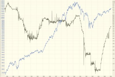
The breakout of the Dow I mentioned recently is now moot. Prices have fallen below the resistance line, so there is no breakout. In fact, this line is getting to be just noise at this point, so I'll probably chuck it soon.
Likewise the potential breakout on the Major Market Index ($XMI) I mentioned last Saturday didn't materialize (thank God) so, again, this is a bullish move that simply isn't going to happen.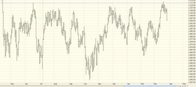
What is happening, and what I did predict quite some time ago, is the Utilities are starting to fall to pieces. The best options I've found on these is on the UTH, but the bid/ask is big enough to drive a truck through. I've drawn two necklines for this head and shoulders pattern. It hasn't quite broken through the lower neckline yet, but if it does, you can see the target I've drawn here is a nice fat distance away.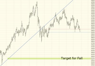
What we're looking for, people, is directional change. Nothing beats a stock that has been going up for years (and has the corresponding high price) which fundamentally changes direction. Below is CLF. You can see where it broke its upward trendline. And I've drawn a downward-sloping channel. There are not that many price points to support this channel yet, but it's not bad, and it illustrates the ship changing course from up to down. That's the kind of issue in which we want to buy puts.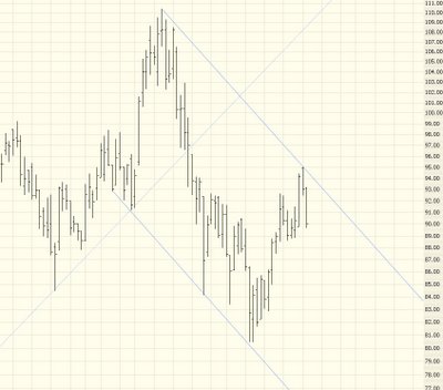
One developing H&S I've had my eye on is iShares Latin America (ILF), but it's relatively thinly traded, and the options on it are terrible (super thinly traded, huge bid/ask spread). Plus the pattern isn't complete.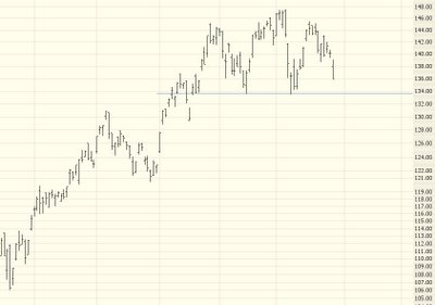
However, a major component of this security is symbol UBB, which has completed breaking an H&S pattern (strictly speaking, the right shoulder is higher than the left, which isn't textbook perfect - - but I'll take it). I'd look to buy puts on this on any pullback to the neckline. It's a lovely chart.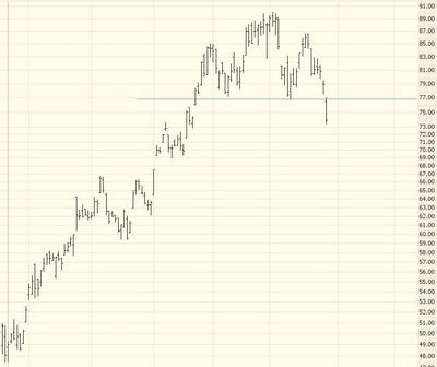
I'll close with APC - - the OIH has been pushing higher lately, but I think it's going to soften very soon, and APC behaves very well. What I mean is that when OIH is weak, APC is especially weak, and when OIH is strong, APC isn't quite as strong. I like the puts on this, which are fairly heavily traded.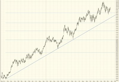
Continued good luck, everyone.....nice to see some sense returning to the markets.

5 comments:
Looks like we have an intermittent top like i had eluded earlier. Still not a direction change technically, dow below 10900 will be it for me.
Coming days will help us guage where the markets are headed. Google went against the market, that seems a bit strange to me. Looks like Google is done its correction and may begin moving upwards.
Walter, my answer is: log scale, log scale, log scale! There is never a need (EVER!) to use an arithmetic scale for anything except for writing a newspaper article and wanting a chart to look scary and dramatic.
Arithmetic scales have no place in technical analysis.
just wanted to point out that google has a new finance section which is pretty well done. You could type in a stock symbol as a google search and it will bring it up using their finance section (previously they were using yahoo). Some neat features that I thought is worth mentioning here.
Tim, why do say only use log charts. IMO they seem to distort price movement. Unless its a parabolic move I dont see the reason to use them.
For stocks that don't have incredible moves, i.e. doubling or tripling in a few months, and for shorter time frames like 1-3 year index charts, there's virtually no difference between arithmetic and "log" - even though what they use often isn't a true log scale.
Here's an example of a long-term chart that would look just silly in arithmetic scale. It's a chart of natural log of the S&P 500, adjusted for reinvested dividends, from 1950 to present.
http://photos1.blogger.com/blogger/3941/1382/1600/chart1.jpg
Post a Comment