There is so much to talk about today!
The stock market has become really interesting lately. My favorite "indicator" is simply this....I'm 100% short the market (about 25 different put positions). If the market is up, and I'm still up, that's a great sign. Because it means when the market's down, I'm really up! Which is what has been happening recently.
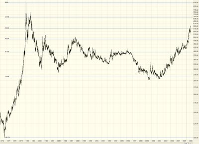
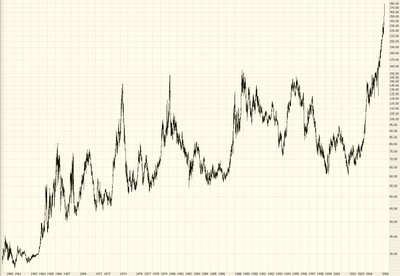
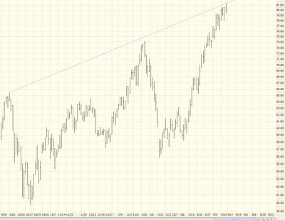
All the hyperbolic crazy sectors are starting to get whacked: copper, crude oil (particularly oil services), gold. I'm waiting for real estate next (see the ETF symbol IYR). I can truly sense the bears getting the upper hand. Do not let the media junk about "new six year highs" fool you. It's completely meaningless. The breadth of the market is becoming more and more thin.
Oh, before we get to the markets.....did you see the brilliant suggestion by the U.S. government to send everyone a $100 check to help out with high gas prices? Is this idiocy in action? Can you say "pandering?" What a bunch of morons! (Or, more appropriate, what a bunch of morons they must assume we are). Gee, if crude oil ever gets back to $10 a barrel, will they send us a bill instead? Ugh! You might want to consider this a good contrary indicator that oil has peaked.
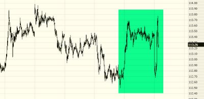
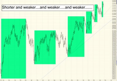
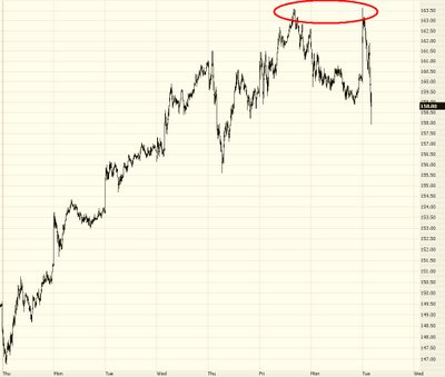
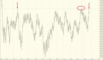
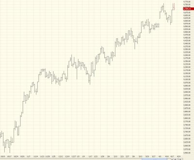
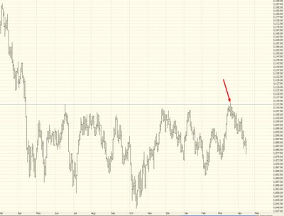
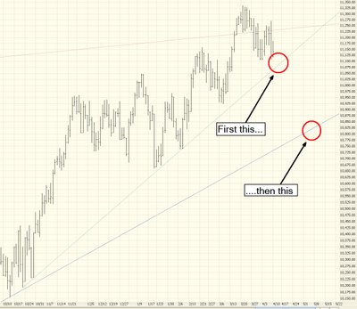
The epic battle between bulls and bears continues. The daily gyrations are getting crazier (I am writing this intraday, and this snapshot was taken earlier):

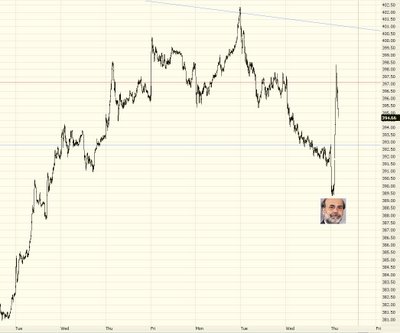
After the China currency news sent the markets down over 50 points, Bernanke's words pushed the market the opposite direction to be up over 50. And it's been bouncing ever since (although, with just 45 minutes left in the market day as I'm typing this, it looks like another up day.......so brace yourself for more "six year high" nonsense). Here is the Utilities sector, indicating the interest rate madness from Ben's mutterings......

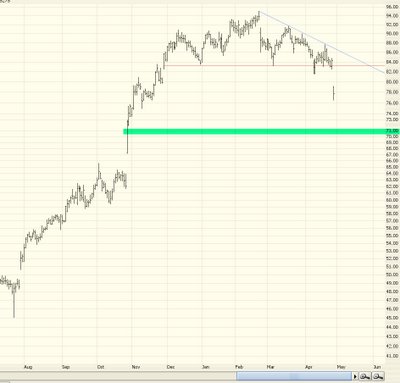
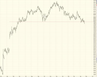
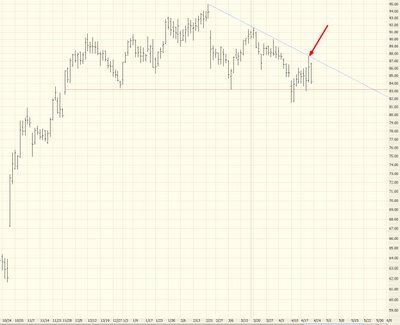
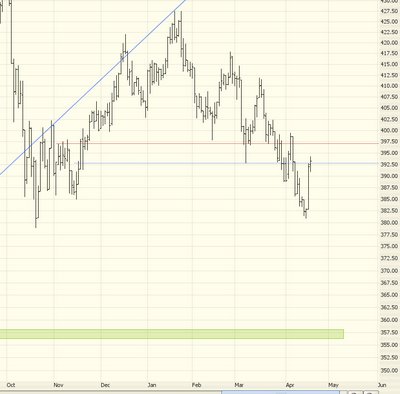
So how do you like that ESRX pick of mine? I've mentioned it a bunch. It was down over 10% today last I checked, which means plenty of the put options are up 200% or 300%. Not bad, eh? I should start charging for this. ;-)

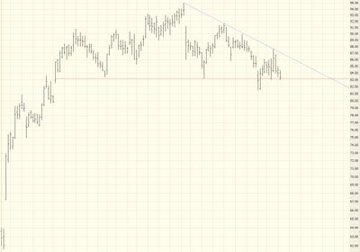
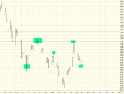
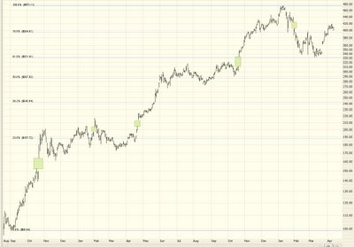
Another suggestion that's worked out great is Health.Net, which I discussed earlier this month. The performance of the fibonacci retracement on this is incredible! Just absolutely amazing. I've circled it to make it more obvious. And the moment it touched the latest retracement, boing, it started inching up.

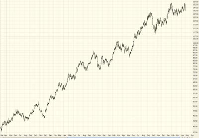
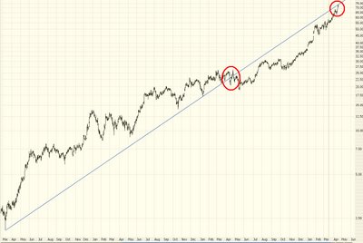
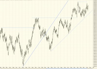
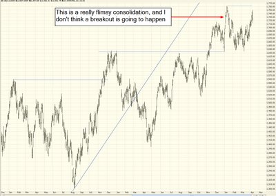
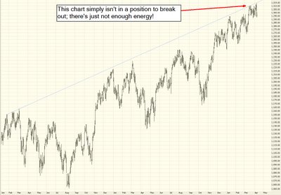
The subject of today's entry is "How Trends End." In the broadest sense, what I've been anticipating (wishing/waiting/hoping, call it what you will) for is a general reversal of the market from uptrend to downtrend. Generally speaking, from 1991 through 1999 the market was in an uptrend. From 2000 through 2002 the market was in a downtrend. From 2003 through 2005 the market was up again. For 2006 so far, it's been a bit of a mixed bag, but generally speaking it's been more up than down. But the shift we want to see is a macro one.
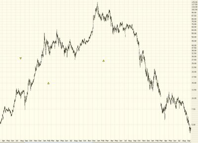
As a single stock example, here's Yahoo - there's a very broad uptrend, which ended in early 2000, and it went into a very broad downtrend......

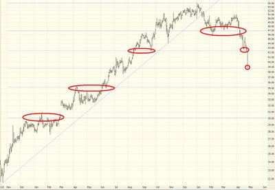
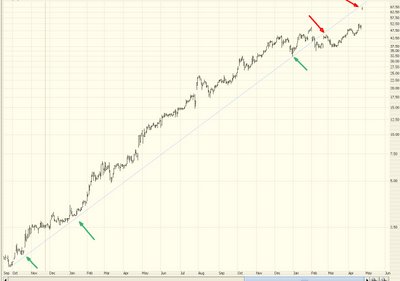
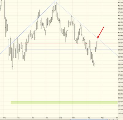
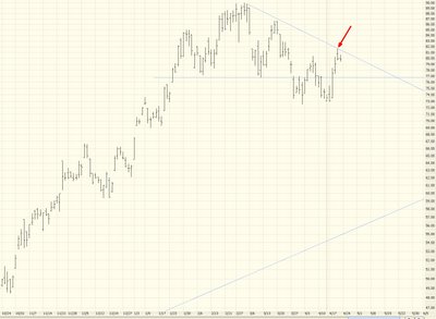
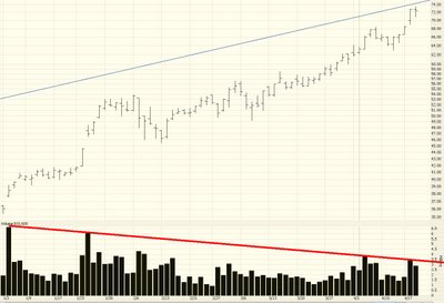
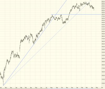
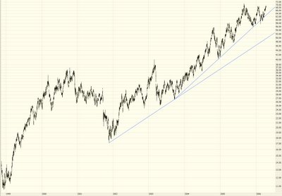
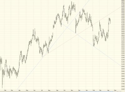
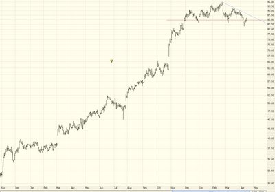
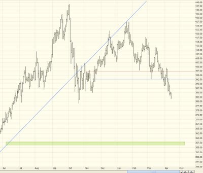
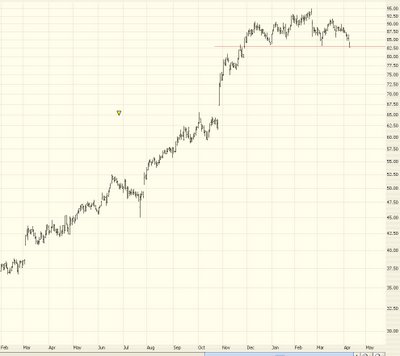
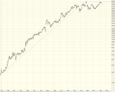
What I'm seeing in chart after chart after chart is a "pooping out" of uptrends. In a nutshell, the market simply doesn't have the power to push these stocks any higher. The pattern of higher highs and higher lows ends when it can't make another higher high.......and if the prices take out the most recent "higher low" than there's a good chance the broad trend has changed. This begins with a chart that looks like the one below (which is a current chart of oil service provider AHC):

Notice how the breakout from the dish pattern simply never materialized. Anyway, I am feeling terrific about the market right now. There's so much interesting stuff happening. Good luck to you all, and thanks for reading what I've got to say.

