Friday, July 29, 2005

Something for our FX Friends

Just a quick comment this for this entry - I dipped my toe into the world of FX trading for the first time today (And profitably! What shall I do with the $70 of newfound green in my account now?) My one position is a short one: NZD/USD (the New Zealand Dollar). Have a look!

Thursday, July 28, 2005

A Tasty Dish

Today the market closed at 4-year highs across the board, with some indexes (like the Russell 2000) hitting never-before-seen highs.

While the market is dashing upward, I'll offer another bullish pick: SVNX. This is a very thinly traded issue, but as you can see, the descent of this stock over the past few months have retraced the price to its breakout point from a beautiful dish pattern. Well worth a look! The stock climbed over 6% today alone, but this is a terribly nice looking chart.

Wednesday, July 27, 2005

Long Winners (Even from a Bear!)

Let's slip off our bear suit for a moment and take a look back at the long positions I have recommended in this blog. I'm pleased to say they've done extremely well. And they are still terrific-looking charts. Let's recap (and don't be surprised how similar these graphs look; the style of their breakouts is quite similar).

BankRate (symbol RATE) continues with a terrific inverted H&S breakout on strong volume:


OpenWave (OPWV) a very similar story.


Kyphon (KYPH) did its third big lurch upward today, climbing well over 10% today alone.


J. Alexander (JAX) is quite thinly traded and has a big bid/ask spread, which makes it less appealing. But the chart is gorgeous.


An old favorite, Corning (GLW) continues strong; up about 30% since I first mentioned it.


Alamosa Holdings (APCS) hasn't quite broken out yet, but it's shaping up really well.


Finally, a salute to Mark Hulbert, who celebrates his newsletter's 25th anniversary. Read his fascinating article here.

Tuesday, July 26, 2005

Tricks with the VIX

I put together this fascinating graph below (remember, you can always click the picture to get a much larger picture) comparing the VIX with the S&P 500. (For those of you wondering what the VIX is, you can read the definition here).


I have put highlighted bands to indicate extremes (both low and high) in the VIX. As you can see, once an extreme is reached, the market tends to snap the other direction. For instance, if the VIX is extremely high (as it was after 9/11/01, when panic and uncertainty reigned), the market was relatively low, and eventually it snapped back.

Over the past couple of years, the VIX has been grinding out new never-before-seen lows, indicating tremendous complacency and a lack of fear in the market - the stuff which so often precedes major bear markets. It has been a long time since we've had a "snap back", but the graph tells the story much better than I can.

Thursday, July 21, 2005

Beware the False Breakout!

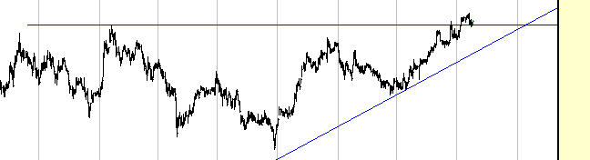
It was naturally disappointing yesterday to see that, in spite of INTC and YHOO getting slammed, the market in general recovered handsomely and actually ended up for the day. This result in a clean breakout of the IWM (Russell 2000 ETF) to a new lifetime high.

Click for a Bigger Picture

Whether this breakout sticks or not remains to be seen. Breakouts need (a) strong volume and (b) plenty of follow-through. Today, due to new (smaller) bombings in London, the market is weak, and the Russell 2000 is over twice as weak as the other major indices. So I thought it would be a good opportunity to take a look at failed breakouts and why they are so meaningful.

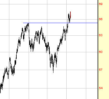
Let's start with an example. Below is a chart of ABRX. As you can see, it broke out above a dish pattern (in fact, I wrote about this chart when the breakout took place). The price clearly goes above the horizontal resistance line, but there are a couple of problems. First, there's no meaningful increase in volume; and second, the price tends to wobble above and below the trendline for a few sessions, indicating hesitation on the part of the price.


I've highlighted where this "breakout" took place; take a look at what happened shortly thereafter.


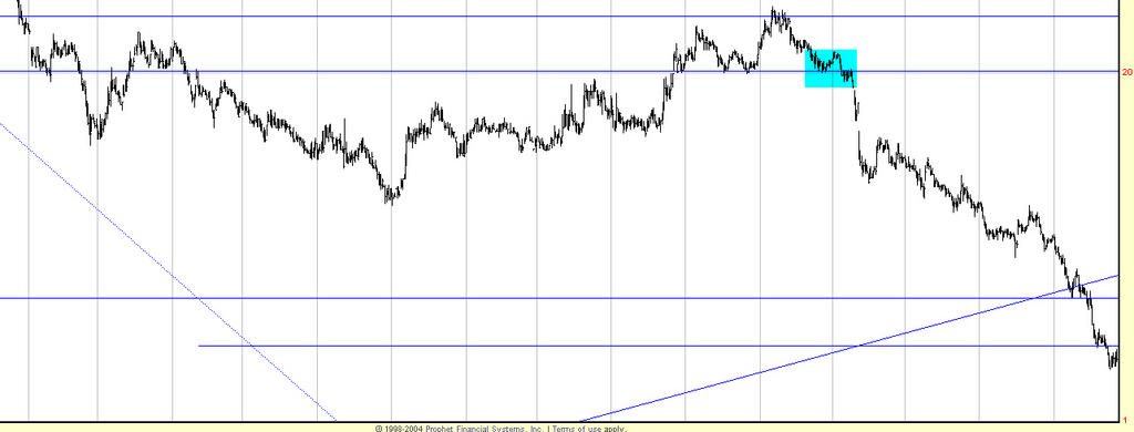
So the failure to follow-through was clearly fatal and invalidates the breakout. Let's look at another example, symbol BKHM. Here is the breakout, and it has extremely strong volume, which is just what you want to see. In fact, the volume surges twice as the price moves upward, and indeed, the stock price did ascend after this breakout.


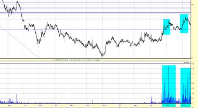
But if you kept that horizontal line on your chart, you would have later seen the price violate it, turning support once again into resistance. This is an extremely serious problem, since the importance of the breakout is completely invalidated by it sinking beneath its breakout point. Let's see what happened next (again, I've highlighted the original breakout point so you can see the price location).


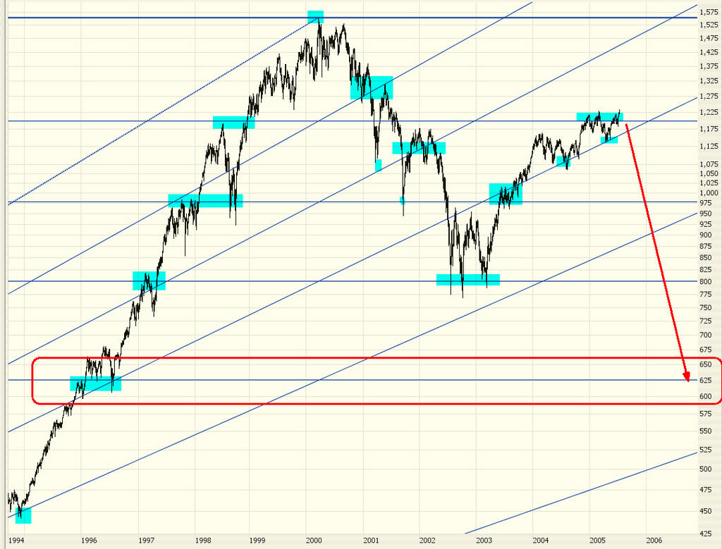
If the recent breakout to new highs among the major indices fails, that lends more strength to my bearish arguments. Stay tuned!

Monday, July 18, 2005

The Big Picture


This chart shows the S&P 500 for the past 45 years (please note that clicking any of these images brings up a much larger, better detailed picture!). I've drawn a Fibonacci retracement and arc that clearly show specific support and resistance levels. I've shaded the green areas to indicate "resting points" of this in index on the way up (notice how the prices tends to "hug" the various retracement lines). I've marked in magenta similar areas on the way down.

The downward pointing arrow shows which level I believe the market will hit next, assuming we start to see prices descending in earnest. This will approximate the levels seen from early 1995 and would represent a nearly 50% drop in the index value.


This graph shows the closer range (the past ten years). As you can see, the next logical direction is down, and substantially so. {Remember, you can click on these images to get a much bigger view.}

Thursday, July 14, 2005

Family Stores - Time to Short?


The market shot up over a hundred points shortly after the open this morning, but I'm pleased to say almost every one of my short positions showed a profit. There's little more heartening to a bear than seeing his stocks still go down in spite of an upward market.

Interesting, the $RUT (Russell 2000), which is more closely aligned to the kinds of stocks I'm shorting than the Dow these days, went down today, in spite of the strength of the other indices.

A specific stock I'll mention - Family Dollar Stores (symbol FDO) - is shown above. I've put in blue the beautiful head & shoulders pattern. Added to which, it's broken through a major supporting trendline. Looks like a good short position to me!

Tuesday, July 12, 2005

A Century-Long Pattern


The graph above (even if clicked) is too small to do this point justice, but I'll say it anyway.

This shows two fibonacci arcs. One of them is drawn from the lowest part of the 1900s (early in the century) up to the "roaring 20s" peak in 1929. The other is drawn from the nadir of the market in 1933 (when the Dow was at 40.60) up to the apex in January 2000 of 11,750, nearly 300 times higher than the value in 1933.

The number of places where the prices "hug" the various fib lines and bounce off of them is almost miraculous to me. There are probably 20 different examples of this. Most astonishing of all is that the lines converge on the peak. Indeed, the 50% fib line from November 1903 almost EXACTLY matches the high set nearly 100 years later!

Breathtaking.

Another Bullish Pattern (in a Bearish Market)


Although I remain steadfastly bearish, the stocks I have suggested recently as buys (KYPH, APCS, GLW, etc.) have all done extremely well. I've got another......BankRate (symbol RATE). The graph is shown above. As you can see, it's another inverted head & shoulders pattern.

You also might want to take a look at OPWV, which has a similar pattern. Both stocks had recent breakouts and have extremely well-defined technical shapes.

Wednesday, July 06, 2005

SPX Goes Into Elliott Wave


Let me be the first to state I am not an expert (or even close) on Elliott Waves. But I understand the basics, and I recognize that the S&P 500 Index is in a nearly textbook perfect Elliott formation (headed to the downside).

By way of reference, check out this primer, then look at the graph above which I've annotated. I've put a small green highlight on the trendline (which extends back to the beginning of this entire rally) that, if broken, spells doom for the S&P. Added to which, the Elliott wave "C" seems to have started, which should take the index lower.

As always, these are just my opinions, but for the bearish among us, these are heartening signs.