
Tricks with the VIX
I put together this fascinating graph below (remember, you can always click the picture to get a much larger picture) comparing the VIX with the S&P 500. (For those of you wondering what the VIX is, you can read the definition here).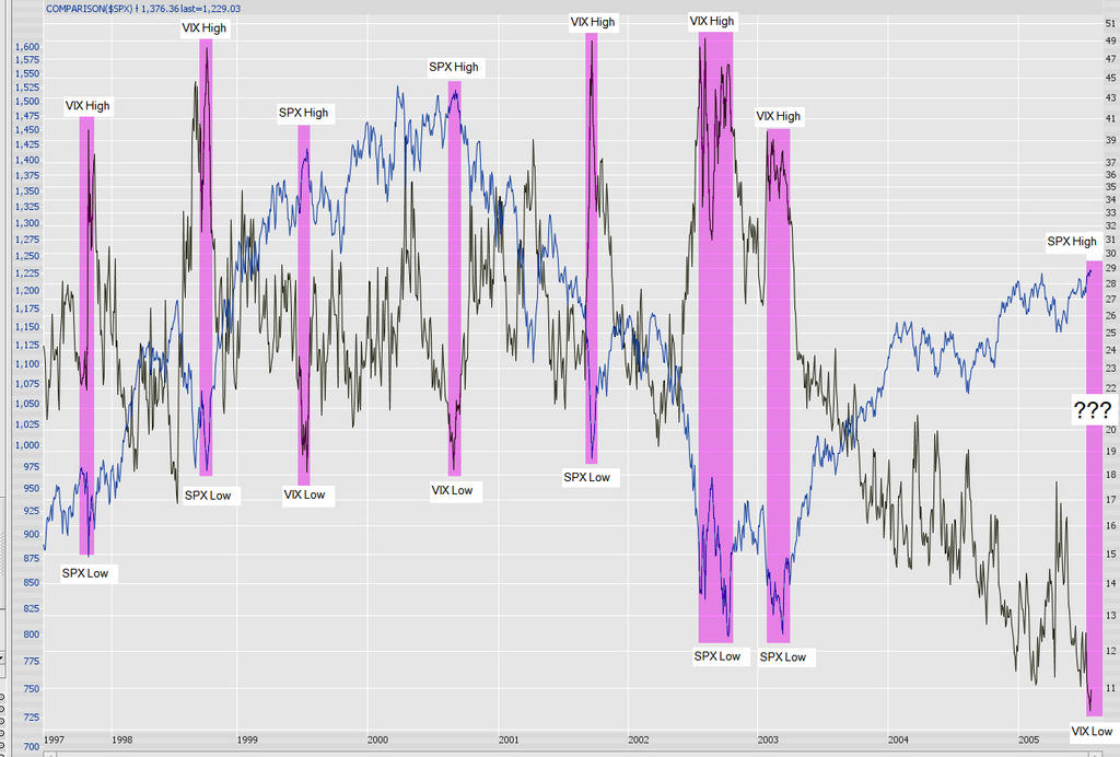
I have put highlighted bands to indicate extremes (both low and high) in the VIX. As you can see, once an extreme is reached, the market tends to snap the other direction. For instance, if the VIX is extremely high (as it was after 9/11/01, when panic and uncertainty reigned), the market was relatively low, and eventually it snapped back.
Over the past couple of years, the VIX has been grinding out new never-before-seen lows, indicating tremendous complacency and a lack of fear in the market - the stuff which so often precedes major bear markets. It has been a long time since we've had a "snap back", but the graph tells the story much better than I can.
No comments:
Post a Comment