
The Big Picture

This chart shows the S&P 500 for the past 45 years (please note that clicking any of these images brings up a much larger, better detailed picture!). I've drawn a Fibonacci retracement and arc that clearly show specific support and resistance levels. I've shaded the green areas to indicate "resting points" of this in index on the way up (notice how the prices tends to "hug" the various retracement lines). I've marked in magenta similar areas on the way down.
The downward pointing arrow shows which level I believe the market will hit next, assuming we start to see prices descending in earnest. This will approximate the levels seen from early 1995 and would represent a nearly 50% drop in the index value.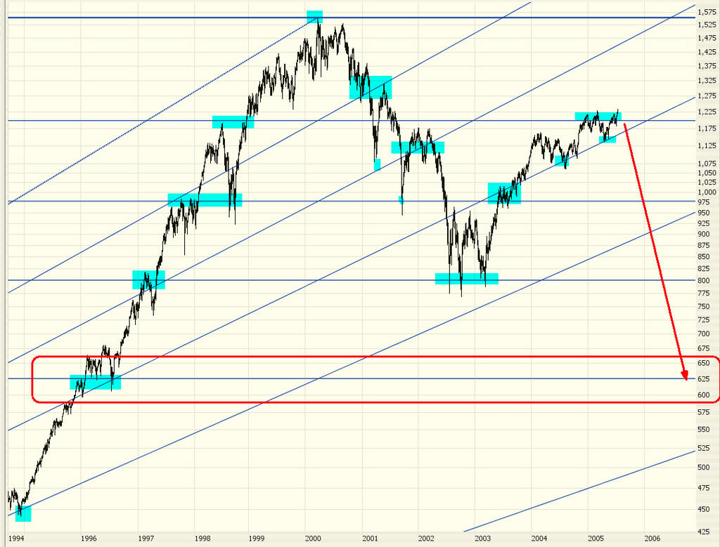
This graph shows the closer range (the past ten years). As you can see, the next logical direction is down, and substantially so. {Remember, you can click on these images to get a much bigger view.}
No comments:
Post a Comment