
Pushing at the Top of Resistance
A picture's worth a thousand words - so I offer you TWO thousand words today. The charts speak for themselves. Here is the S&P MidCap 400: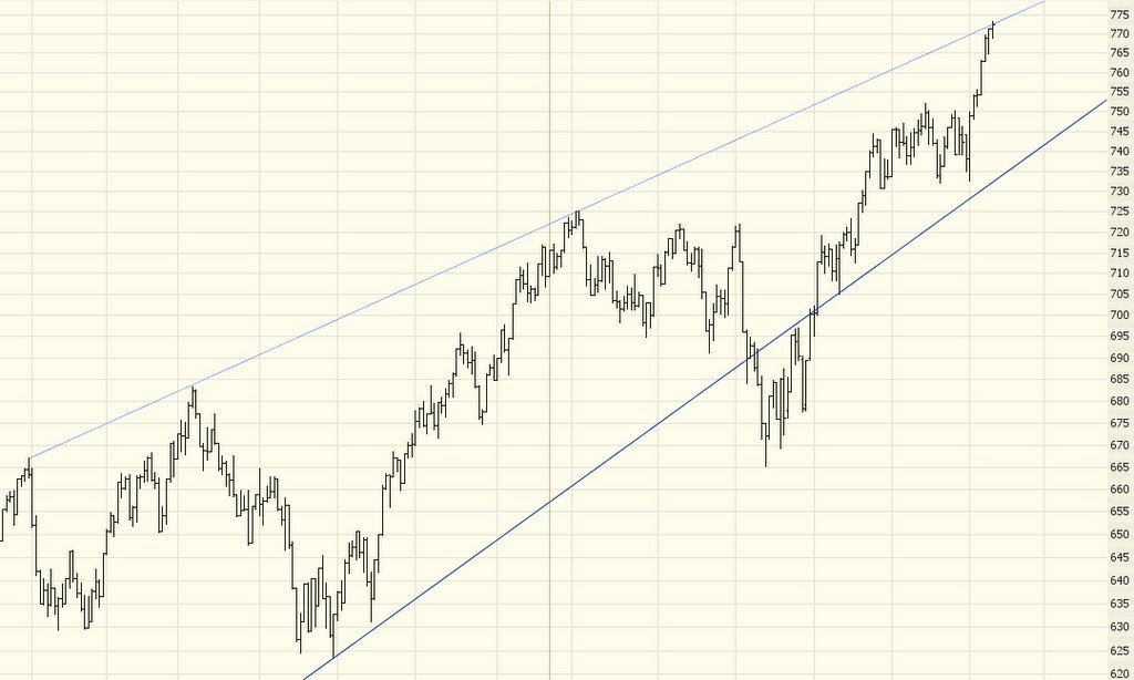
.....and the Russell 2000......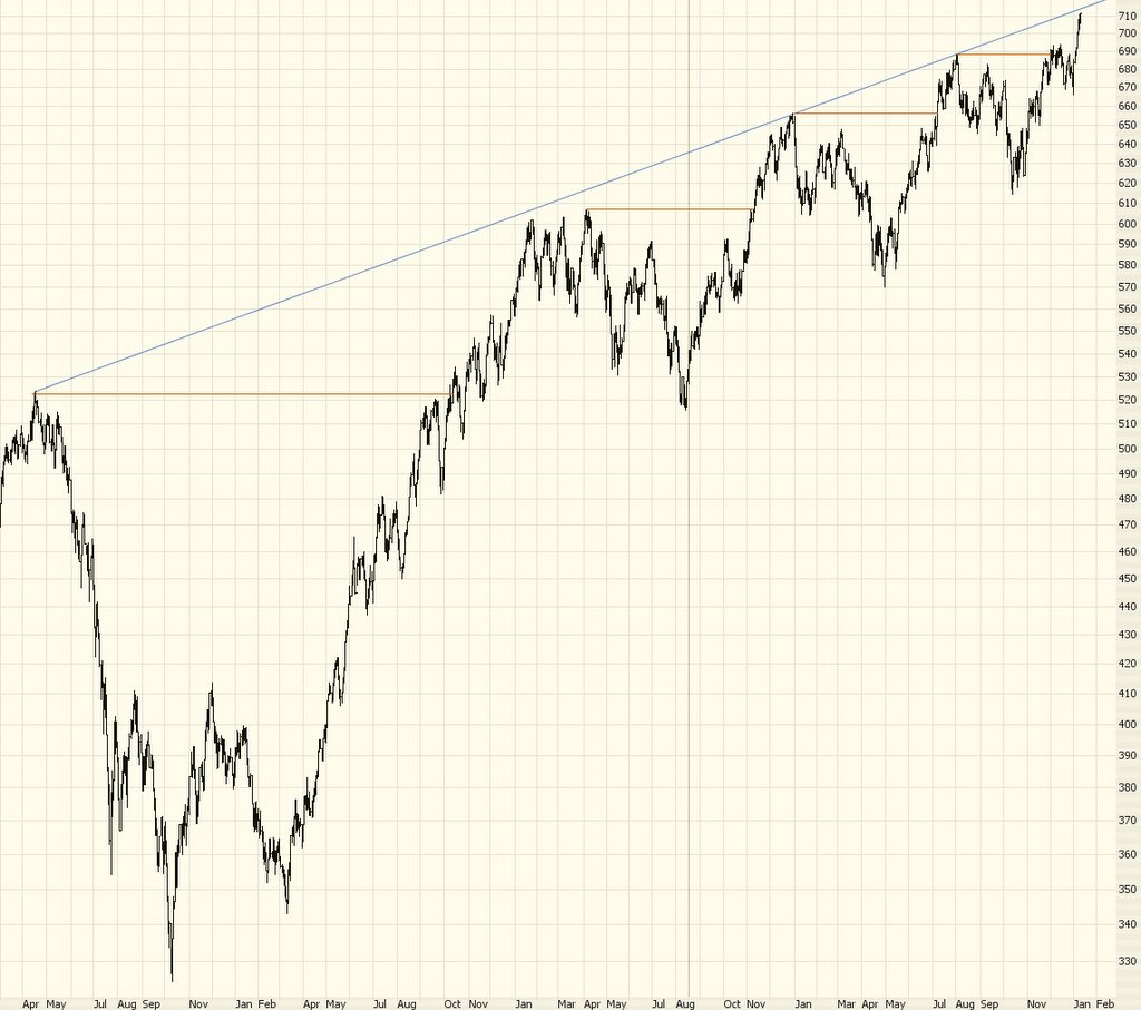
Notice in particular the progressive breakouts in the Russell 2000, and how each one is shorter-lived and weaker than the prior one. These breakouts are indicated by the horizontal lines you see drawn four times on the graph.
1 comment:
Hi Tim,
Why did you choose to make the S&P Midcap 400 chart have a narrowing channle instead of a constant width channel? That is, why are your lines not parallel? Is there some volume-related reason or is it something else?
Thanks,
-Scott
Post a Comment