
Blast From the Past
The market continues to slowly turn from upward to downward. This isn't a one day event. It's like turning the Queen Elizabeth around. But it's happening.
I look at a lot of charts, and I can't remember such a "technical analysis friendly" market as this one. I noticed something amazing yesterday, however. Check out this chart of the MDY (which is the S&P 400 MidCap). I've provided some arrows to illustrate my point.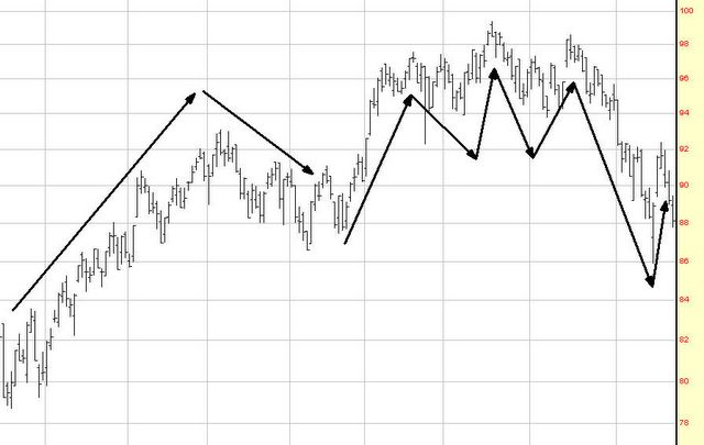
Got it? Now look at this one.
The scaling differences distort things a little, but I think you'll agree that these charts are essentially identical. A rapid rise followed by a perfect head & shoulders pattern, a break beneath the neckline, a recovery, and a subsequent collapse.
Now I'll tell you what you are looking at: the first chart is the MDY from February to June of 2002. And the second one is from right now. Specifically, November 2004 until the present day.
The key fact is this: the aftermath of the pattern shown in 2002 was a 30% drop in the market. And frankly, we're a lot higher now than we were then. Draw your own conclusions. But if history repeats itself, it's time to short as much MDY as one can afford.
No comments:
Post a Comment