Friday, April 28, 2006

Not With a Bang, But a Whimper

Microsoft was the big headline-grabber today, losing about 11% of its market cap, its worst loss since 2000. Back in April of 2000, a Microsoft bombshell started to blow the NASDAQ apart. No such luck today - the NASDAQ fell only about 1%.

Remember MicroStrategy (MSTR) executive Michael Saylor? He's the outspoken CEO of the firm who, in March 2000, pledged $100 million to a free, online university (nothing ever came of the pledge). MSTR at one point lost over 99% of its stock value, although it's recovered to be down "only" 97% these days.

Take a look at this graph, and note in particular today's drop (this doesn't even capture the magnitude of the drop, since I took the snapshot intraday, when the stock wasn't down as much):


What's interesting here is - - once again! - - the trendline. Notice how it "jumped" to the other side, just like a dog jumping over a fence. So now this trendline has magically changed from support to resistance. It's particularly interesting since today's high exactly touches the underbelly of the trendline.

This "pooping out" of stocks is what I'm seeing more and more of. You can look at LEH, GS, CME - - all kinds of examples. So it's not like suddenly the market is crashing. But individual stocks are engaged in quiet trend shifts (as discussed yesterday) from broadly up to broadly down.

It all starts with one good down day. Here is Cummins (CMI) today as a fine example:


This kind of shift is very subtle, but from my observations, once a stock has had a "mini crash" like this, it creates a very different attitude toward the stock from the investing public, and you will often see it begin steadily eroding instead of building - so "higher highs, higher lows" changes into "lower highs, lower lows."

See you on Monday!

Thursday, April 27, 2006

How Trends End

There is so much to talk about today!

The stock market has become really interesting lately. My favorite "indicator" is simply this....I'm 100% short the market (about 25 different put positions). If the market is up, and I'm still up, that's a great sign. Because it means when the market's down, I'm really up! Which is what has been happening recently.

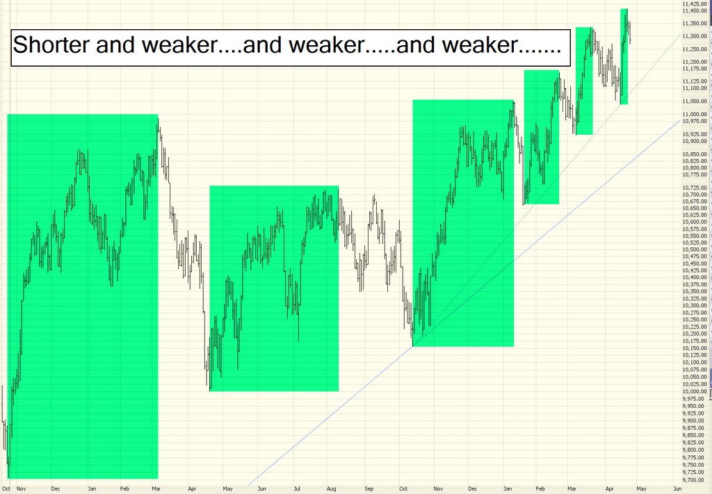
All the hyperbolic crazy sectors are starting to get whacked: copper, crude oil (particularly oil services), gold. I'm waiting for real estate next (see the ETF symbol IYR). I can truly sense the bears getting the upper hand. Do not let the media junk about "new six year highs" fool you. It's completely meaningless. The breadth of the market is becoming more and more thin.

Oh, before we get to the markets.....did you see the brilliant suggestion by the U.S. government to send everyone a $100 check to help out with high gas prices? Is this idiocy in action? Can you say "pandering?" What a bunch of morons! (Or, more appropriate, what a bunch of morons they must assume we are). Gee, if crude oil ever gets back to $10 a barrel, will they send us a bill instead? Ugh! You might want to consider this a good contrary indicator that oil has peaked.

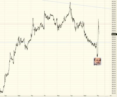
The epic battle between bulls and bears continues. The daily gyrations are getting crazier (I am writing this intraday, and this snapshot was taken earlier):


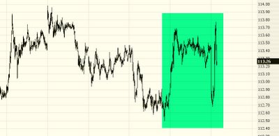
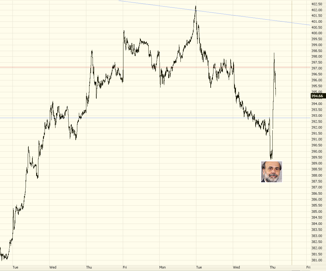
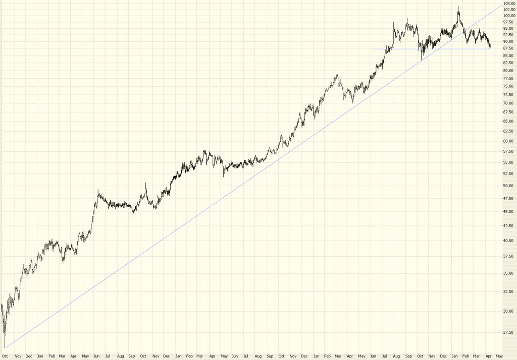
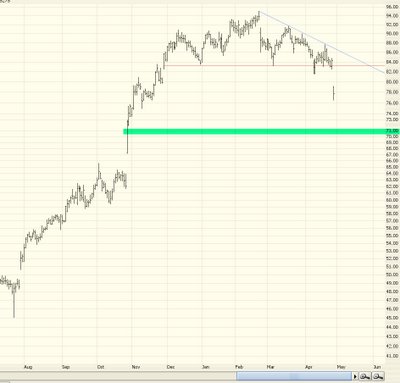
After the China currency news sent the markets down over 50 points, Bernanke's words pushed the market the opposite direction to be up over 50. And it's been bouncing ever since (although, with just 45 minutes left in the market day as I'm typing this, it looks like another up day.......so brace yourself for more "six year high" nonsense). Here is the Utilities sector, indicating the interest rate madness from Ben's mutterings......


So how do you like that ESRX pick of mine? I've mentioned it a bunch. It was down over 10% today last I checked, which means plenty of the put options are up 200% or 300%. Not bad, eh? I should start charging for this. ;-)


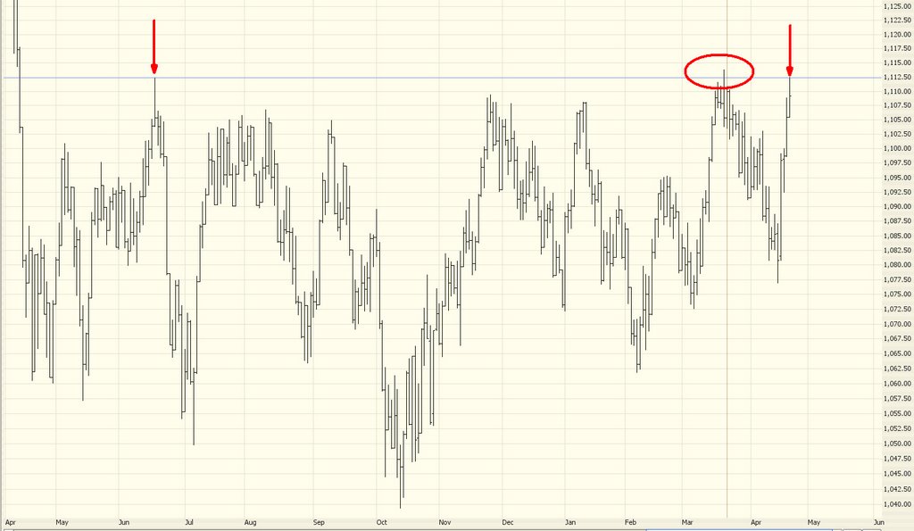
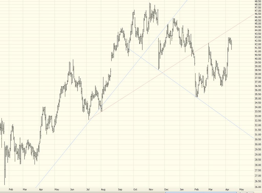
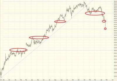
Another suggestion that's worked out great is Health.Net, which I discussed earlier this month. The performance of the fibonacci retracement on this is incredible! Just absolutely amazing. I've circled it to make it more obvious. And the moment it touched the latest retracement, boing, it started inching up.


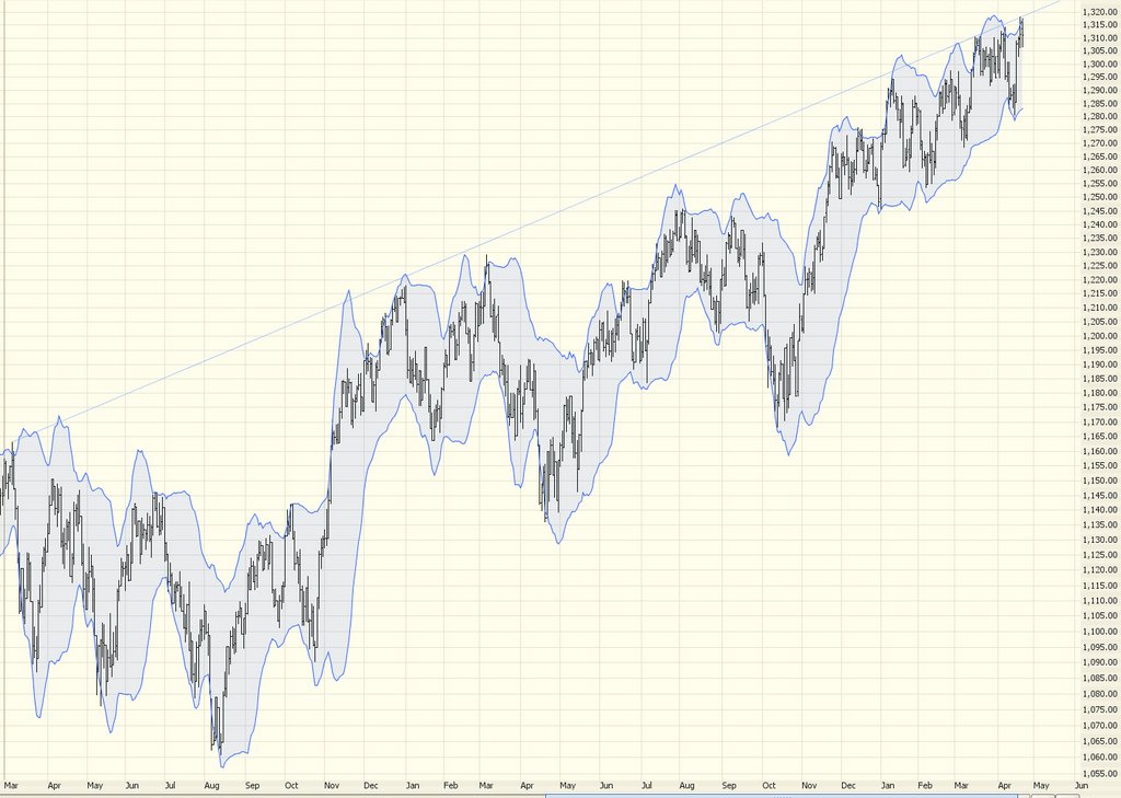
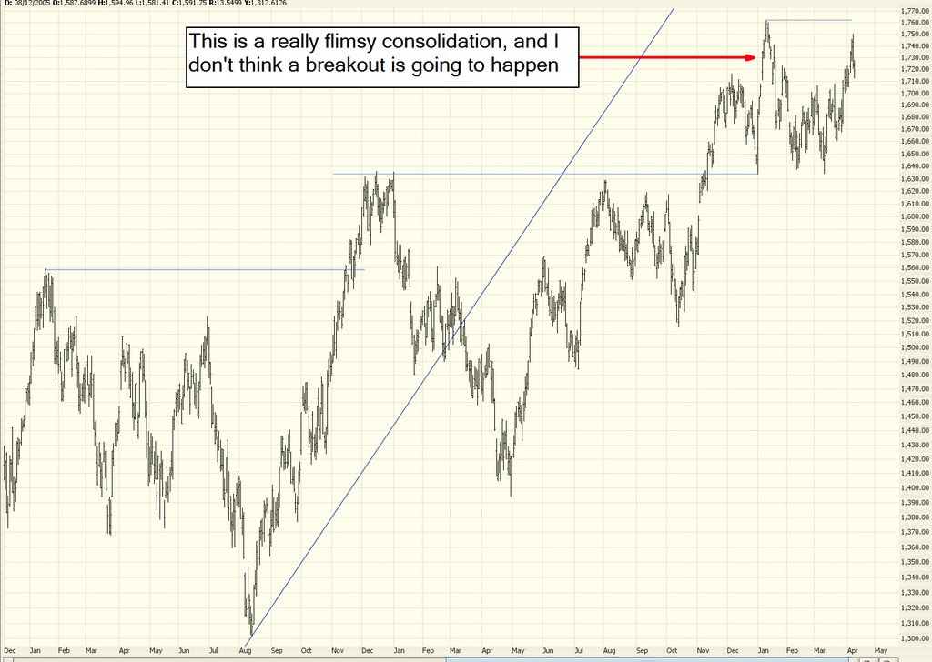
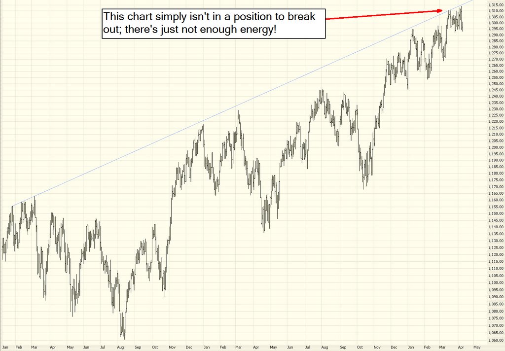
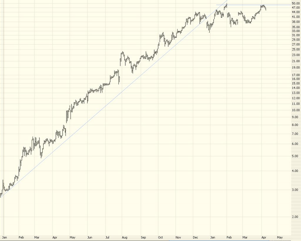
The subject of today's entry is "How Trends End." In the broadest sense, what I've been anticipating (wishing/waiting/hoping, call it what you will) for is a general reversal of the market from uptrend to downtrend. Generally speaking, from 1991 through 1999 the market was in an uptrend. From 2000 through 2002 the market was in a downtrend. From 2003 through 2005 the market was up again. For 2006 so far, it's been a bit of a mixed bag, but generally speaking it's been more up than down. But the shift we want to see is a macro one.

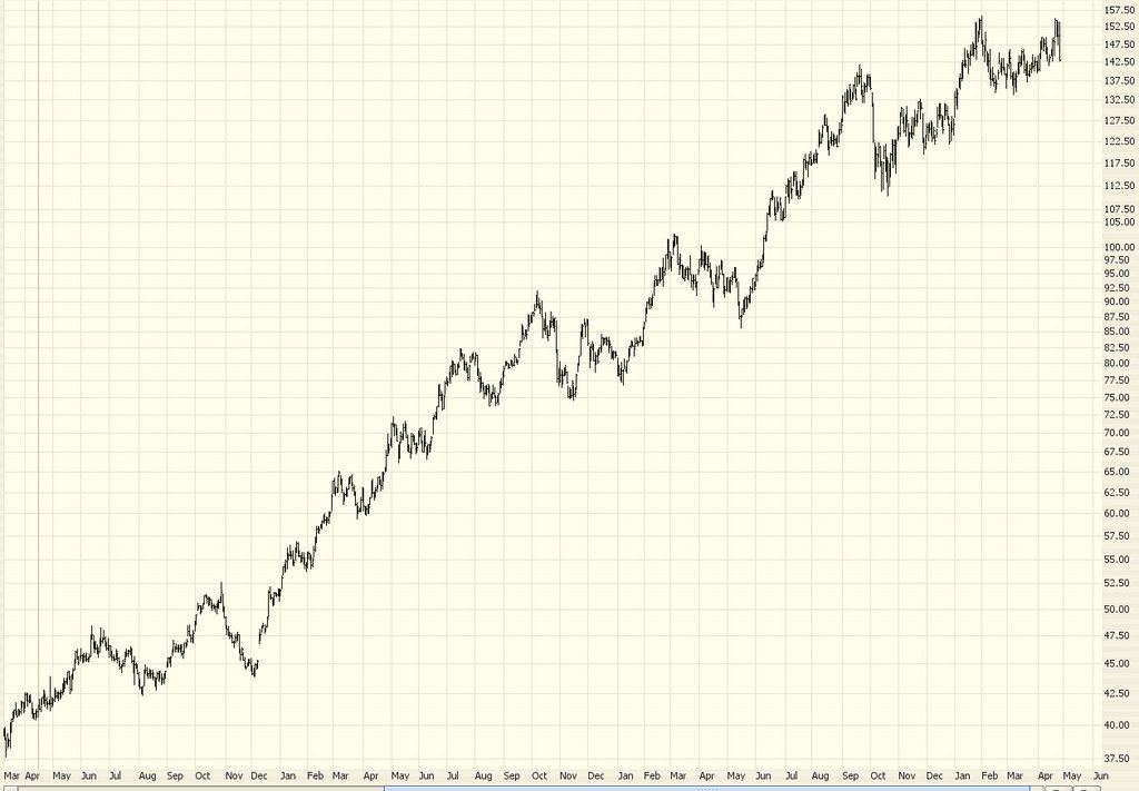
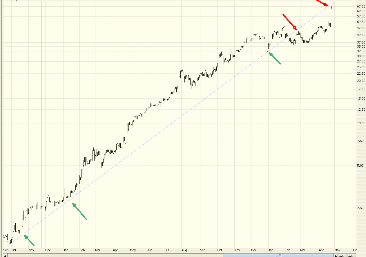
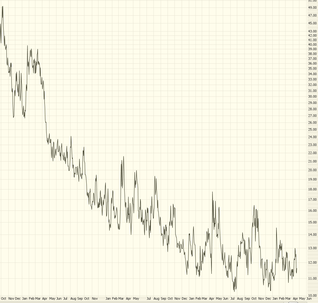
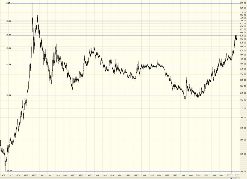
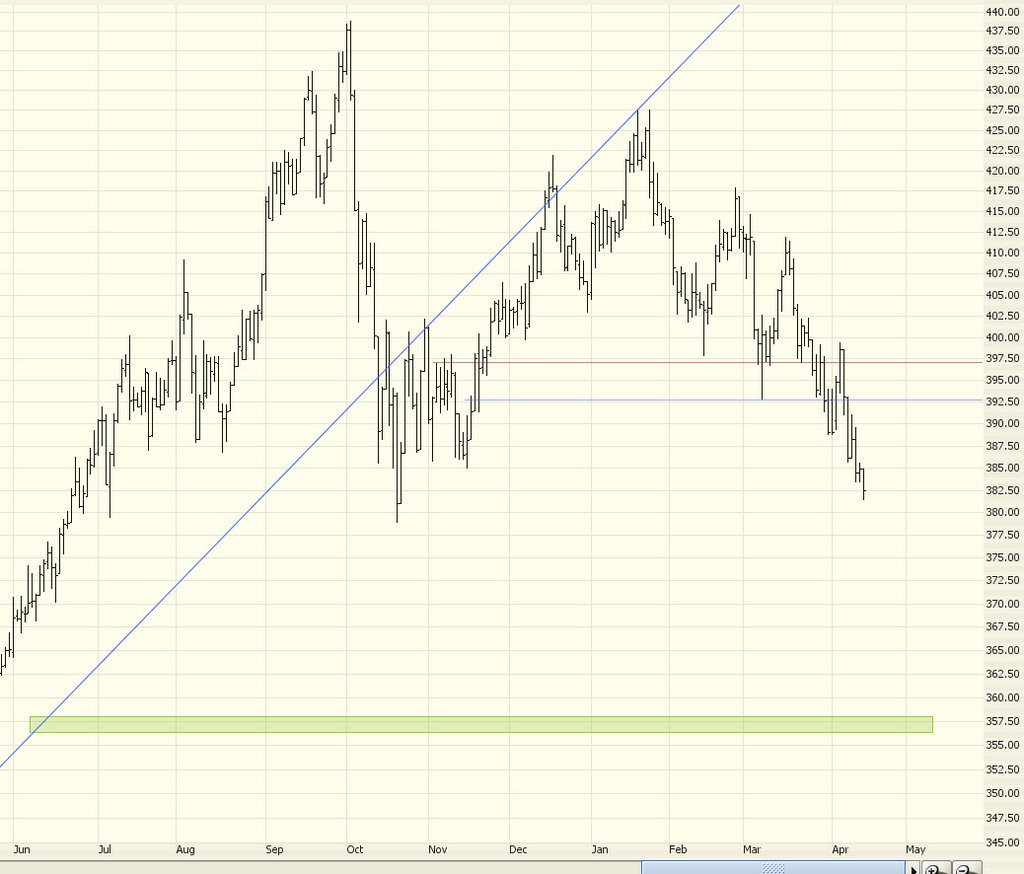
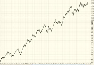
As a single stock example, here's Yahoo - there's a very broad uptrend, which ended in early 2000, and it went into a very broad downtrend......


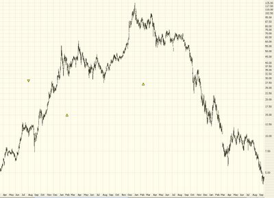
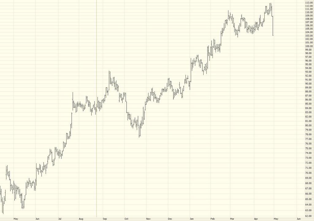
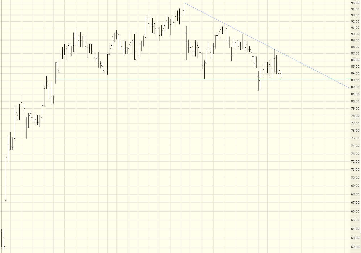
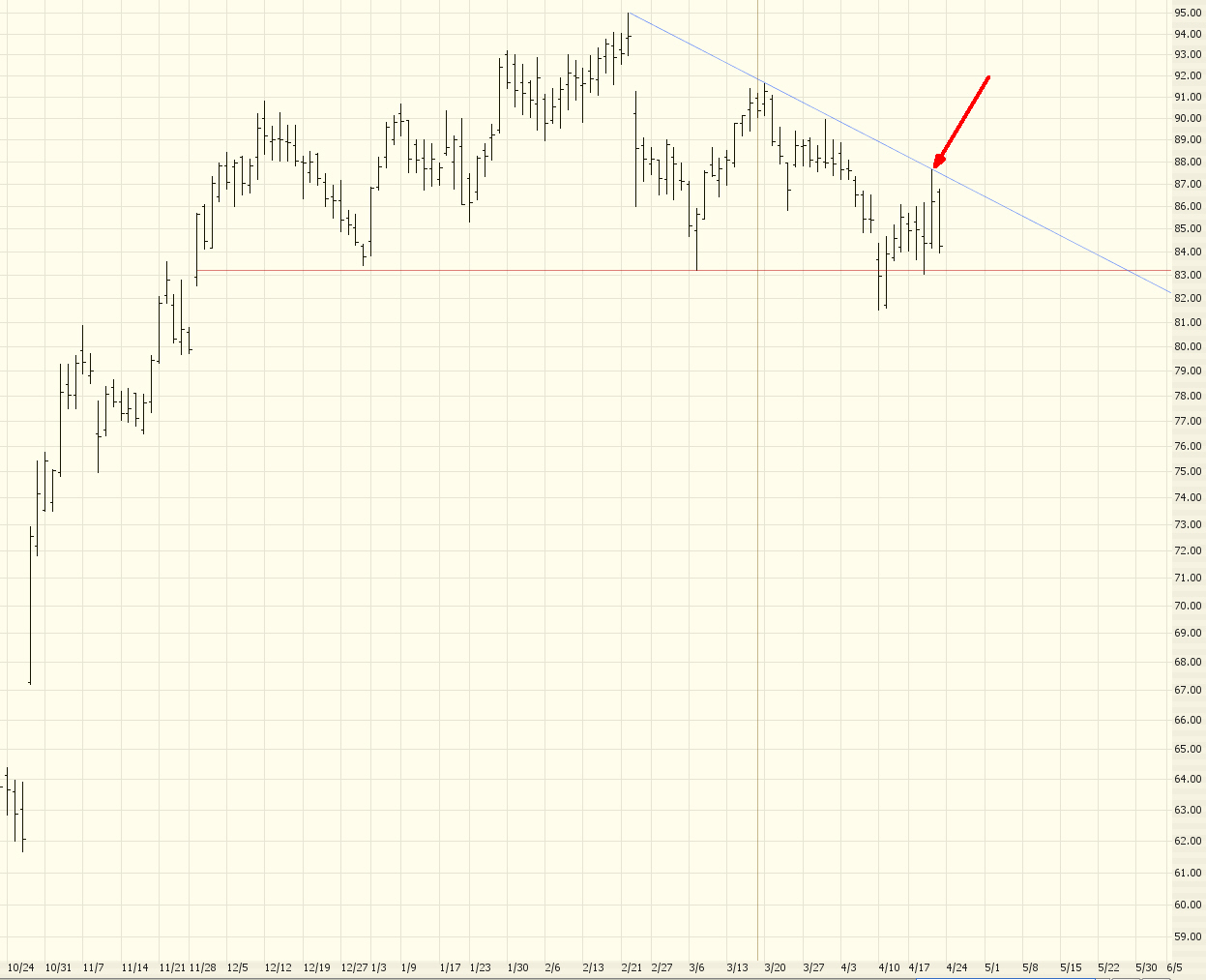
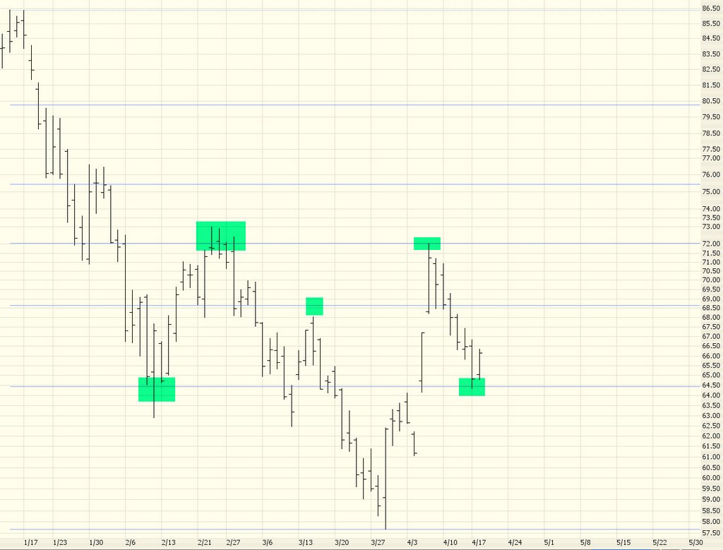
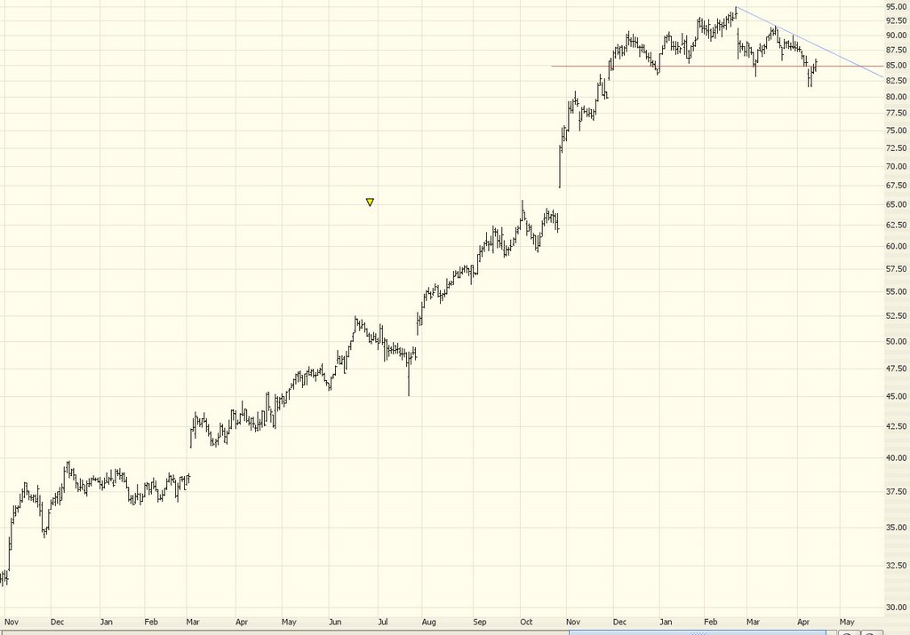
What I'm seeing in chart after chart after chart is a "pooping out" of uptrends. In a nutshell, the market simply doesn't have the power to push these stocks any higher. The pattern of higher highs and higher lows ends when it can't make another higher high.......and if the prices take out the most recent "higher low" than there's a good chance the broad trend has changed. This begins with a chart that looks like the one below (which is a current chart of oil service provider AHC):


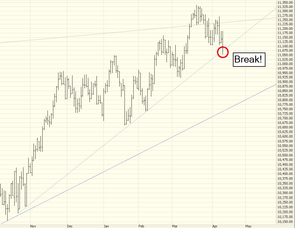
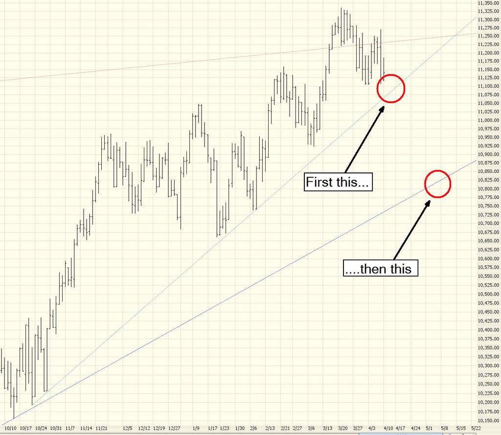
Notice how the breakout from the dish pattern simply never materialized. Anyway, I am feeling terrific about the market right now. There's so much interesting stuff happening. Good luck to you all, and thanks for reading what I've got to say.

Tuesday, April 25, 2006

Stop Me If You Think You've Heard This One Before

The saturation of green on my screen from my short positions is my simplest, favorite indicator that things are clearly going the way of the bears. (Da Bears....) Lovely stuff.

Crude has double-topped. Energy stocks are completely exhausted. And hyperbolic insanity like CRS and TIE are reversing. Beautiful.

Let's take a look at a few charts.

First is the Dow. I want you to look at something interesting (particularly you, hurricane5.....) I've highlighted in green all the bullish rises over the past 18 months or so. Do you notice a trend here?

(1) The length of each rally is progressively shorter
(2) The gain of each rally is, by and large, progressively smaller.

The most recent one is just pathetic. The "rally" lasted three days. (Constant reminder: click any image to see a much larger one).


Crude oil has reached a complete saturation point in the media. Everyone is talking about the spectacular rise in crude, in gold, in copper, silver.........and, as all good contrarians know, when every flippin' schmoe on the planet is talking about how high or low something is, it's probably time to fade the position. Crude tried to push higher today, but went limp fast.....


Look at Genentech (DNA). Head & shoulders patterns do not come much cleaner than this. I could absolutely see this heading down to $60.


A similar pattern, mentioned here many times already, is Express Scripts (ESRX). I still have no clue what this company does (and I take a certain amount of pride in that, being a pure technician). It's a stupid company name - - do they write screenplays rapidly or something? No matter. It's headin' down.


And from our Tilting At Windmills department, I humbly offer a NTRI chart once more. This dynamo rocketed higher today based on blowout earnings. I dunno; looking at the trendline, I'd like to think it's reaching its potential at this point. But I've been wrong on this one more than once before!

Friday, April 21, 2006

Bigmouth Strikes Again

What a week! In spite of the Dow going up consistently this week, it seems broader markets are petering around. The NASDAQ in particular, falling over 1% today, is definitely showing signs of age.

Below is the $SPX with Bollinger Bands. As you can see, it's way up at the tippy-top of both the resistance trendline and its Bands. It seems a softening from these prices is just about inevitable.


The Dow Utilities, which is critical to watch since it is inversely correlated to interest rates, has its head & shoulders pattern plainly intact. I've put an arrow indicating where it has not overcome its downward-sloping trendline. The green shaded area is the price target I've set.


One contrary chart I've got is $XMI (the American Major Market index) which, if it breaks above the line shown, would give a bullish signal. It has been repelled by this line in the past, although it made a weak attempt above it recently.


Express Scripts (ESRX) looks better than ever as a short. It failed to penetrate its descending trendline, and it gave a bearish engulfing pattern today. This on top of the important fact that it's in a marvelous H&S formation.


Lastly is Unibanco Uniao De Bancos (UBB), which is in a similar pattern as ESRX. Same reasons, same prediction.


Enjoy the weekend, everyone!

Thursday, April 20, 2006

What's the Frequency, Kenneth?

First, for those convinced I only do bearish picks, I'd like to refer to a post I made last year for BankRate (symbol RATE) where I suggested buying it when it was about $20. It has, in the 10 months since then, shot up about 150%. Not bad for a bear, eh?


On the self-flagellating side, I apologize for not posting earlier today a retraction of the Google short suggestion. I was looking at the chart, and it dawned on me that since the prices were neatly resting on top of the Fib retracement, it wasn't exactly a great place to short it. Sure enough, stellar earnings pushed the stock WAY higher after hours (something like up $40 at last glance).

Looking at the sky-high (sky-sky-sky high market, more like it), I recall Warren Buffett's 1974 quote in Forbes where he said he felt "Like an oversexed guy in a whorehouse. Now is the time to invest and get rich." But I'd turn that quote on its head. I think the opportunities to short (or buy puts) is just as exceptional now.

I'm going to let the charts do most of the talking now. Here's the $SPX. As you can see, it couldn't cross above its well-established resistance line. It seems the recent (admittedly lusty) push higher is out of steam.


Gold had a big down day today, after doing little put soaring the past couple of years. Prices don't go up forever, I guess, even in manic commodity markets.


Here's the NDX, which spent almost the entire day in the red, in spite of the Dow being up over 100 points earlier in the day. Weakness here is key. As I've said repeatedly, a cross beneath the lower trendline would be great news for us bears.


The Dow Transports seem to have topped out as well.


And the beloved VIX......can you say "overconfident"? Seems to me the market is counting on perpetually higher prices. The fear factor is just about nil at this point.


Below are the current symbols for my potential shorts (upper list) and current shorts (well, actually, they're puts, but it's close enough).

Wednesday, April 19, 2006

How Soon Is Now?

These are the times that try bears' souls.

Oh, my fellow doom-and-gloomers, it's been a tough few days! Indeed, it's been tough since, oh, about October 2002! Ah, well. Hope springs eternal in the savage breast. And the one bullish glimmer in my black bearish heart, the stock of my employer, has been up quite a bit lately. So at least that's going well!

Let's start off with a couple of interesting short picks. One is pretty risky and the other is fairly obvious.

The risky one is Allegheny Technologies, the specialty metal producer which has been on a huge tear for three years, up over 2,500%! Check out the trendline I've drawn, which was violated a year ago. The prices have finally pushed their way back up to the underside of this ascending resistance line, and this "kissing the underbelly" represents a relatively safe place to short the stock. I'd put in a stop price of $75, because this is a very strong stock.


Another reason ATI might be a good short is that, on the whole, volume has been getting lighter. Notice the line drawn on the volume graph below and see how volume has been generally waning in the face of the stock's ascent. To be fair, the dollar volume of the stock is probably pretty steady.


One short I've had a while which is doing nicely - and continues to look promising (particularly considering its fall during the last couple of super bullish days) is McKesson (MCK). It's a lovely topping dome pattern, pure and simple.


I'm watching the Nasdaq 100 ($NDX) very closely, because a fall-away from the saucer pattern being built would be very bearish. Notice how the prior two saucer patterns were much, much bigger than the current one.......and they didn't even go up that much even when complete. What we want to see is (a) a failure for the saucer to form and (b) subsequent to that, a cross beneath the trendline shown here.


Lastly is the Dow Utilities ($UTIL, which has the ETF of UTH). The monster rally yesterday, fueled by relief over interest rate increases, pushed the price of this back to its neckline. It's getting soft again now, and I remain convinced the target shown in shaded green is going to be met.

Tuesday, April 18, 2006

Fibonacci Friendly Apple

First off, what in God's name is happening in the market today? It's acting hysterical! I admit I don't watch CNBC, but is there some wild rumor flying around? The market's been higher all day, but at one point it absolutely strapped on turbo blasters and soared higher, only to flip around and given back a lot of the recent gain (make no mistake, it's still up big-time today, but it's acting like a maniac).

Anyway, that's not what this post was about. I wanted to offer an example of what I call a Fibonacci friendly stock. In this case, Apple Computer (AAPL).

Not long ago, I pointed out that Apple was at a resistance point and that it would make a fairly safe short. This turned out well. One reader sent me a nice note saying he had made 40% on the puts for this based on the suggestion. Anyway, as you can see from the daily chart below, AAPL does tend to "cling" and "bounce off" its resistance lines. I've highlighted some areas in particular.


What's cool about these is that they make great exit points too. Take a look at this graph, which is the minute-by-minute chart of AAPL over the recent past:


I've marked five levels on the intraday chart where AAPL does this "bounce." For the recent short suggestion, the ideal time to close it out would have been the area marked as "5". As you can see, it touched the resistance line perfect before flipping around higher.

Fibs definitely don't work with all securities, but when you find one that is Fibonacci friendly, it tends to consistently behave that way.

Monday, April 17, 2006

Oil, Gold, Copper Stratospheric

I don't usually look much at commodities in this blog, but they've been going so insane lately it's worth a look. Remember that clicking any image makes a much larger image show up for greater detail.

Gold has been the talk of the town for a couple of years now. Here is a chart going back to the late 1970s, which includes the run up to about $875. Judging from the Fibonaccis, it seems that gold is well on its way to the $690 level.


But the real show is in copper, which is reaching levels never seen before. This kind of action would be the equivalent of Gold pushing past $2,000 per ounce. Fellow technician Michael Kahn makes a strong case for copper's rise to point to big-time inflation in our future.


Lastly, crude oil has also been pushing into never-before-seen levels. Will it cross into $80? Impossible to say. My recent bearishness on the oil services sector has not served me well, as crude's push higher and higher provides excellent support to bulls of these stocks.


Returning to the stock market......it seems we'll finally have a good reason for the market to snap out of its indecision....earnings! This week there will be hundreds of earnings reports, including IBM, Motorola, and Yahoo on Tuesday, Apple, JP Morgan, and Intel on Wednesday, and Google (plus an ungodly number of others...) on Thursday. This should provide for a lot of fireworks as the outlook on these companies clears.

The Dow 30 continues to be weak, clearing falling below and closing below the short-term trendline. The market is not clearly bearish until and unless it crosses below the medium-term trendline shown beneath it. The circled area indicates the close below the short-term trendline.


A few weeks ago, the stock market did make an attempt to push higher, but as you can see in the chart below, it was a flimsy attempt. This particular index is the American Major Markets ($XMI), and although it did cross above the resistance line here, the crossover was weak and short-lived. It has since slunked lower, yielding doubt on whether this pattern will ever truly become bullish.


One specific short suggestion from a reader of this blog is Kinder Morgan (KMI), which has a nice pattern, as shown below. Both the major ascending trendline has been broken and a good-looking topping pattern (which will be confirmed if it crosses the horizontal line shown) are in place.

Friday, April 14, 2006

Good Charts for Good Friday

Happy three-day weekend, everyone. No sermons today. Just a few good charts.

First up is AutoDesk. I mentioned this one a few days ago and a "blast from the past." It looks like it's losing ground (which is good, since it's a short recommendation, as all of these are). If this really starts to fall, the key question is whether it will fall all the way down to the lowest trendline you see or not. I'll leave that judgment for later.


ESRX is a high-risk/high-reward trade. It's in a pretty decent topping pattern, and I'd suggest using that descending trendline (as opposed to a neckline) as my stop-loss point.


Perennial favorite GOOG looks like it's weakening after a stury push upward over the past six weeks or so. The Fibonaccis are helpful guides, but obviously not rock solid lines in the sand.


Holly (HOC), although a big winner over the past year for the bulls, is so lofty it represents a relatively low-risk short position, as dictated by the trendline you see. It seems to have peaked for now.


Finally, the utility ETF whose symbol is UTH is continuing to weaken, as I thought it would a couple of weeks back. The green highlight indicates my earlier prediction for how far it might fall.

Wednesday, April 12, 2006

No-News Wednesday

I'm sorry, everyone. I love writing these posts, but I just have nothing to say today! Hopefully the market will do something interesting tomorrow (it's the last trading of the trading week, remember) and the muse will inspire me. Until then, continued good luck!

Tuesday, April 11, 2006

Medium Term Trendline Broken!

OK, good. In spite of an earlier bounce off the supporting trendline, the Dow lost its footing and broke beneath it. The first step in the two-step process I outlined yesterday has taken place.


It's clear the market is losing steam. We're also exiting the strong November-April season and heading into the weaker May-October season. As earnings season approaches, the opportunity for the long-awaited downdraft may be upon us. The next psychological barrier is to break below 11,000. Next, it needs to break below the 10,922 low set on March 8th. That would bring an end to the series of higher highs and higher lows that has been in place since October 13 of last year.

Dow Trend Bounce

Just a quick intraday post - take a look at the first graph in yesterday's post, showing the two ascending trendlines the Dow has to break in order to turn bearish. The market's down right now, but look at how the Dow hit the higher trendline and immediately bounced.


As long as I've been doing this, I continue to be amazed. Anyway, you can see the market respects this line in the sand. It's got to break the line clearly to make the next move down.

Monday, April 10, 2006

The Return of Johnny One-Note

Last week, I tried to buy the bullish argument. I really tried. I even made a few suggestions on stocks. But I just don't buy it. This market, it seems to me, is too weak to do what the bulls want it to do.

The post-bear market recovery that started in October 2002 and continues to this day have pushed some stocks hundreds - even thousands - of percent higher. But as I look at all the major averages and hundreds of different major stock charts, I cannot escape one simple conclusion: even if I wanted to buy, there's just really not much good "merchandise" out there. It's far easier to find stocks prone to fall than it is to find stocks prone to rise more.

Let's take a look at the latest charts of three major U.S. averages. First, the Dow Jones 30. In order to get truly bearish, it needs to break its short-term ascending trendline as well as its medium-term ascending trendline. This index has been inching up for the past six months, and it has the potential to keep doing so unless both of these trendlines are clearly broken.


Next is the NASDAQ 100, which has been weaker than the Dow over the same time period. This index has, over a three month period, formed a modest saucer pattern, but it's relatively wimpy and the prices simply aren't pushing strongly higher. If this pattern collapses, I think it might mark the turning point.


Lastly is the all-important S&P 500. The ascending trendline, representing resistance, is easy to see here, and recently it was pushing up against this trendline. Prior attempts to push past it have failed, and after last Friday's swoon, I think the hope for any big breakout is fading. Anything short of stellar Q1 earnings in the market could mean the end of what has to date been a fairly steady advance by the market over the past three and a half years.

Express Scripts and a Look Back

A week ago I suggested shorting Avalon Bay and Health Net. I'm pleased to see both of these stocks have fallen pretty much every day since then.

Another stock I've been watching a while is Express Scripts (ESRX) which broke its neckline today and seems like a pretty clean short sale.


Another high-flier which looks like it has double-topped is old favorite NutriSystem (NTRI).


My recent "bullish picks" absolutely stink. I think I'll stick with being a bear! There are just so many great shorts out there right now. If I get time, I'll review a few this afternoon.